Part of White Night Melbourne 2018 (February) was a membership drive. Registration was via the website member join form. White Night runs from 7 pm to 7 am, when people carry their mobile, not a laptop. Completing the old join form on a mobile was a poor experience. I drew upon HTML5 for Web Designers and Mobile First to come up with improvements to the join experience. I designed four changes to make it easier to complete the form via mobile devices. It was a thrill to see this first iteration implemented in time for the event.

The old join form

There were 17 fields in the old join form. To complete the old form, Australians were to fill out 9 required fields, and 7 optional fields. A drop-down for Country defaulted to Australia. There was no default value selected for State. Despite that 90% of registrations were Victorians, choosing a state was required for all Australians.
A phone number was a required field. To receive SMS notifications for collection items, a separate field asked for a mobile number. If you wanted membership renewal notices, you had to type your email address twice.
Poor experiences completing the old join form on mobile

On a touchscreen device, the phone and email inputs did not provide helpful keyboards. This made it difficult to enter details and reduces accuracy. For instance, entering a phone number mandated an extra tap to switch to numeric keys. The 10 digit buttons across a narrow screen are small touch targets. It was even harder to enter an email address. For example, after typing the initial letters of me@example.com.au, you’d have to switch:
- to numeric keyboard for the @ symbol
- back to enter more letters
- again for every full stop “.” character!
Then the form asked people to confirm their email address. So do all that tapping and switching all over again!
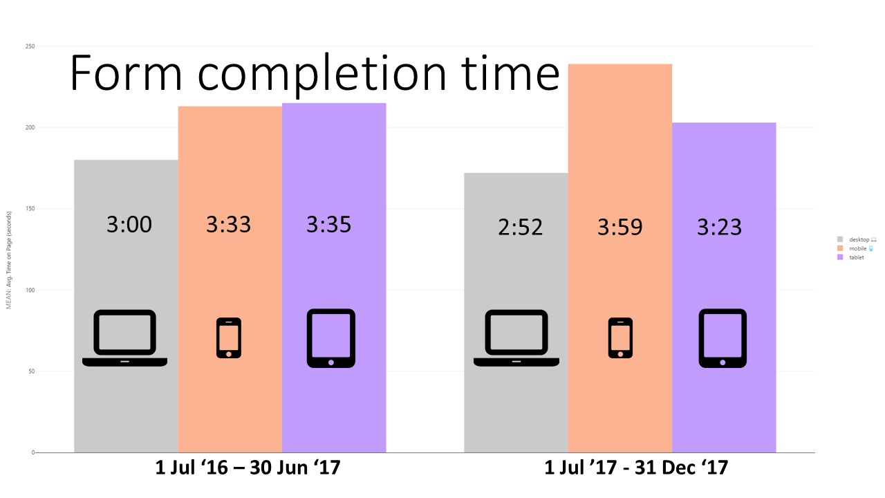
From July to December 2017, analytics reported that completing the old form on a mobile took over a minute longer than on desktop.
Completing the old form on a mobile was a poor experience that took too much time. This presented a significant barrier to our membership drive. The mobile form improvements sprint was on!
Improvements to form input operability
Collaborating with our developer I set out to make mobile form improvements. A few small improvements that would result in a superior joining experience.
Select a default that matches most users
With 90% of Australians choosing Victoria as their state, it made sense to set this as the default. Setting this as the default reduces the effort for the majority of users. It also maintains the same number of interactions for interstate or international visitors.

Using input type="tel" for a phone number
Changing the HTML input type to “tel” makes it easier for mobile users. They get a familiar, large button dial keypad to enter their phone number. Additionally, autofill options can appear above the dial pad. These only need one tap to input your entire phone number.
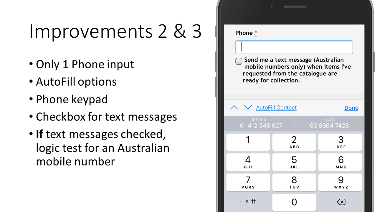
A checkbox and validation for SMS opt-in
Internal data showed when members opt-in for SMS notifications, we do not need a secondary contact number. Instead of asking for a separate phone number for SMS notifications, I changed the design. My simplified form design asks for one phone input and a checkbox. I worked with our developer to create validation code. When the checkbox is checked, validation checks the input is in the format of an Australian mobile.
Using input type="email"
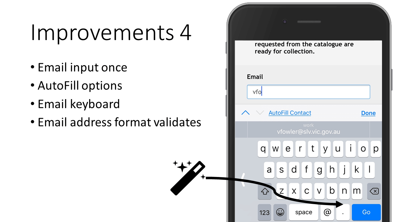
By changing the HTML input type to “email” it becomes easier for mobile users. The email keyboard has an @ symbol, and common .com and .au domain extensions from a long press on the full stop key. Like phone, email autofill options need only 1 tap. Furthermore, the HTML5 input type=email provides basic email address format validation in all modern browsers, not just on mobile. I used all this as a compelling argument to remove the Confirm your email address question.
Outcomes of mobile form improvements: a superior joining experience
We changed the doctype to HTML5, and made a handful of code tweaks. Next, I tested via BrowserStack and on real mobile devices too. Then our developer deployed the changes in time for the weekend event. Thank you, Troy!
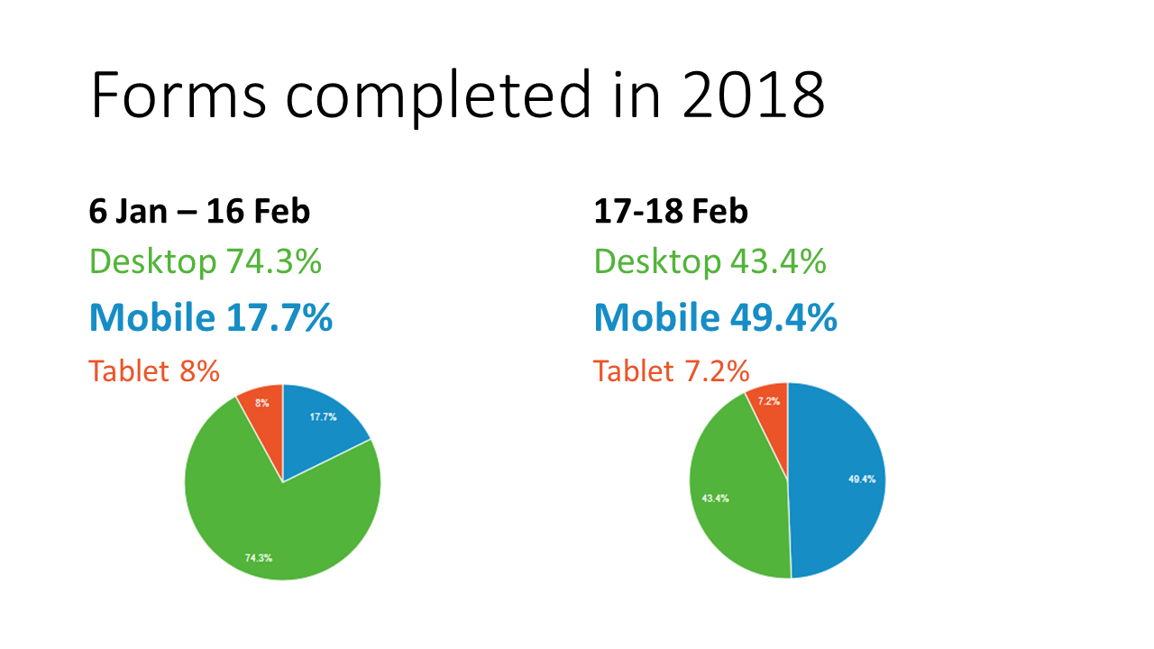
In the 6 weeks leading up to deployment, desktop devices continued to reign. Desktops accounted for 74% of form completions, while mobile had less than 18%. Over the weekend of White Night, almost 50% of forms were completed on mobile devices.
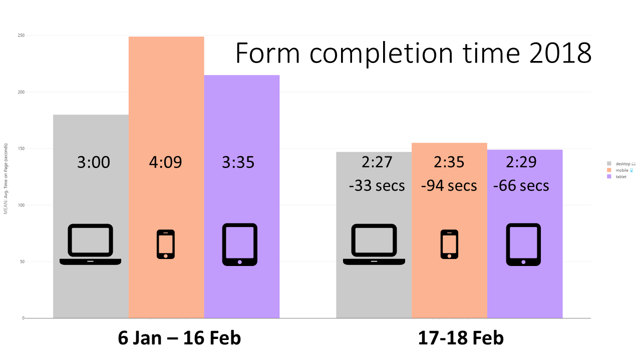
In terms of time taken to complete the form, this release levelled the playing field across devices. The new form saves each mobile user 94 seconds. These mobile form improvements also made the desktop experience faster. Throughout 2017, there were 22,704 join forms completed. If last year’s registrations all used the new form on mobile, we’d save 593 hours!
This year’s event was a trigger to embrace mobile form improvements. These improvements make it faster to complete, and easier to fill out. They also provide more accurate data. The design principles underpinning these changes persist beyond White Night. No matter where or when, completing the form on your mobile is now a superior experience. This design shift set us on a new course. The future has iterative developments of member registration and innovation in onboarding processes.
2 comments
Comments are closed.