- Onboard users to accessible keyboard shortcuts
Accessible tooltips make keyboard shortcuts easy to discover when users need them, through natural use of web applications.
- Design annotations for form accessibility
I share my use of Figma toolkits to annotate designs. I’ll focus on form design annotations to communicate accessibility requirements.
- Inclusive design transcripts for a video component
I designed improvements to transcripts in a video component including multiple languages, left-to-right scripts, and avoiding disorienting people.
- Add a visual “you are here”
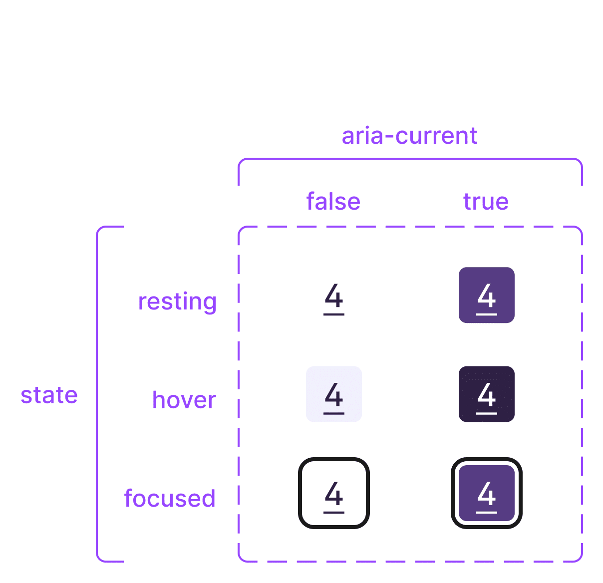
You are here indicators help us orient ourselves when visiting a website. I added a visual you are here signal to the current page in navigation menus.
- Colour and contrast coding a form prototype
I used wireframes and flows to start coding a prototype form wizard. My artifacts aided our handover process. I levelled up my skills and mastery of tools.
- Creating form navigation for a web prototype
Create navigation within and between steps of a prototype registration form. Use semantic HTML instead of classes for CSS. Patterns for back links and branching.
- Wireframing a web form wizard
I sharpened my wireframing skills, uncovered form and flow improvements, and created thoroughly commented artifacts that aided my handover conversation.
- A small win to fix your LibCal interface
It’s a small win to fix the interface in your library room booking software. Add stripes to help sighted users distinguish their booking.
- How to improve form validation messages
Our registration form wizard used a mix of inaccessible default browser error messages and ambiguous custom form validation messages in red text.
- When and where to set input spellcheck =false
A form will spellcheck your name, email and postal address, giving false positives. I’ll share how I tweak this for a less jarring form-filling experience.
- Identify input purpose for awesome usability and accessibility
Identify input purpose (autocomplete values) makes easier and faster form filling experiences for everyone entering personal or payment information.
- Digital prototyping workshop at the 2019 UXLibs conference
To improve the mobile experience of reserving a group study room – the case for my digital prototyping workshop at the 5th UXLibs conference.
- Input width makes it easy to guide sighted users
Setting input width to guide sighted users reduces cognitive effort needed to fill out forms. I’ve created HTML and CSS code to set width of a postcode field.
- Form wizard remediation – from research to design
My lightning talk on remediation of technical and non-technical issues in a registration form. This effort brings us nearer to our goal of no barriers.
- Easily removed HTML5 article tags found lurking in form
While manual accessibility testing a form wizard, HTML5 article tags were announced by the screen reader. This confused our participant on every step!
- Results of accessibility testing a multi-channel form wizard
In September 2018 I conducted manual accessibility testing on the first iteration of member registration as a form wizard. This was my lightning talk.
- 4 Mobile form improvements for better UX – registration
I designed 4 mobile improvements to a registration form. These UX improvements make it faster to complete, easier to fill out, and increase data accuracy.
- Service blueprint shows the pains of delivering membership
In January 2018, I created a service blueprint showing inefficient internal processes of how the business delivers membership.