
Accessible tooltips make keyboard shortcuts easy to discover when users need them, through the natural use of web applications. Frequently used action buttons are candidates for keyboard shortcuts. As a UX designer, our problem is how might we onboard users to these keyboard shortcuts. For keyboard shortcuts to be learnable, it’s crucial to avoid the common pitfalls of temporary “What’s new” release notes or pop-up one-time intrusive tutorials.

In this post, I share my design of accessible custom tooltips with keyboard shortcuts for a web application. I cover:
- Passing WCAG 2.1.4 Character Key Shortcuts (Level A)
- Avoiding keyboard shortcut conflicts
- Design annotations for keyboard shortcuts
- Passing WCAG 1.4.13 Content on Hover or Focus (Level AA)
- Testing with Accessibility Acceptance Criteria
Following all this, I wrap up with an interactive Codepen demo showing my HTML, CSS, and ARIA.
But first, why a custom tooltip? What’s wrong with using HTML standard title attributes? The takeaway from a Paciello Group post 1:
If you want to hide content from … assistive tech users and keyboard only users, use the
— Steve Faulknertitleattribute.
Abandoning the title attribute, our use case for a custom tooltip is to provide an auxiliary description 2. Keyboard shortcuts add information to a tooltip describing a button.
WCAG 2.1.4 Character Key Shortcuts (Level A)
When keyboard shortcuts include at least one non-printable keyboard key (e.g., Ctrl, Alt) they meet this success criterion.
Keyboard shortcut conflicts
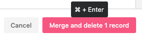
Successful keyboard shortcuts avoid conflicts with layers of competing tech. For instance, desktop browsers have keyboard shortcuts such as Ctrl S to save the page, and Ctrl T to open a new tab.
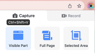
Browser extensions also have keyboard shortcuts. For example, Awesome Screenshot has a default shortcut for capturing the visible part in the browser viewport: Ctrl Shift V.
While it is impossible to dodge shortcut clashes with all browser extensions, user research could reveal popular extensions to plan around.
Popular screen readers such as Jaws and NVDA make use of both single-key shortcuts and combinations together with a modifier key.3
h– Move to the next heading- Navigate table content –
Control+Alt+up/down/left/rightarrow keys
Browsers, extensions, and assistive technologies have a vast array of keyboard shortcuts. With three layers of web technologies, a little user research will go a long way toward selecting keyboard shortcuts that avoid conflict.
Design annotations for keyboard shortcuts
Annotating designs is a straightforward way to articulate requirements. Below is a button and companion tooltip with keyboard shortcuts. These design annotations communicate user benefits.
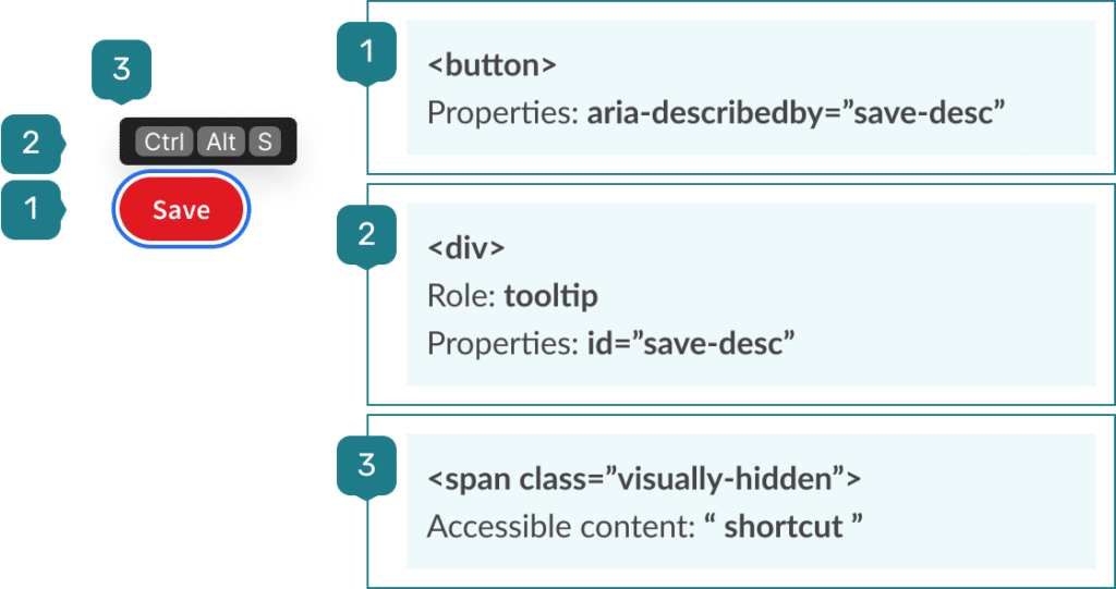
For a screen reader to announce the tooltip content, it needs:
- The button to use
aria-describedbyreferring to the tooltip role="tooltipas “assurance thataria-describedbyworks reliably where supported”4- An
idattribute matching thearia-describedby.
So far, the screen reader announcement is:
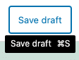
Save [pause] description, Control Alt S, button
This is a poor experience. It is not a comparable experience 5 as it undermines the quality of the content. To improve on this, I insert a visually hidden phrase to concisely identify the following content as a shortcut. See design annotation 3 above. Now the screen reader announces:
Save [pause] description, shortcut Control Alt S, button
With the screen reader user experience improved, let’s turn our attention to the business benefits of semantic HTML.
In a previous post on design annotations for form accessibility, I listed three business benefits of using semantic HTML:
- Simpler code for developers to write
- Easier to read code for quality testers to check and for developers to maintain and refactor
- Less code to store and serve, and faster to render in the browser
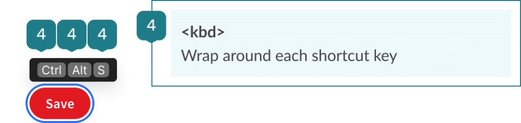
It takes less effort and time to use the semantic <kbd> element and simple styling than any other HTML and CSS.
My last annotations for a tooltip with keyboard shortcut component are the relevant Accessibility Acceptance Criteria.
By annotating designs with Accessibility Acceptance Criteria, we can confidently document, build and test our tooltip with shortcut keys component.
Testing with Accessibility Acceptance Criteria (AAC)
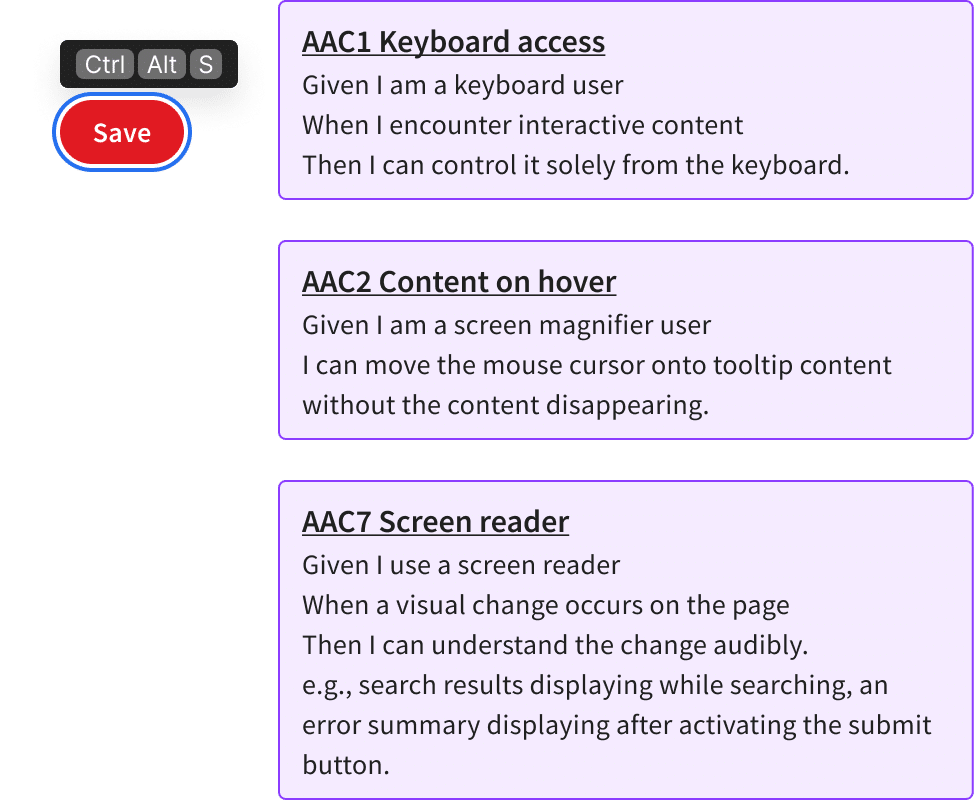
To test the tooltips with keyboard shortcut component, I use 3 of the 10 Accessibility Acceptance Criteria (AAC). I’ve forked Ross Mullen’s Testing with AAC6. First, I merged checklist items related to using a keyboard from AAC2 into AAC1. AAC1 Keyboard access now has 4 checklist items.
AAC1 Keyboard access
For tooltips, the relevant checklist item is:
Can the keyboard trigger tooltips and hover content?
How to check: Use Tab and Shift + Tab to navigate to open hover content
AAC2 Content on hover
Second, I wrote a new checklist item based on the hoverable success criterion in WCAG 1.4.13 Content on Hover or Focus (Level AA)7. AAC2 Content on hover maps directly to this success criterion. The intended outcome of both is:
I can move the cursor [from the trigger element] onto the tooltip content without the content disappearing.

My proposed checklist item for tooltips8 is:
Do tooltips (hover content) remain visible when I move the pointer over the tooltip?
How to check:
1. Hover over an element that triggers additional content.
2. Move the pointer over the additional content. Check the additional content is still visible.
Moving the pointer over the additional content is where many tooltips fail. The tooltip often disappears as soon as the pointer moves outside the triggering button. However, I stumbled upon an example tooltip 9 that passes this check.
By using CSS :hover styles on a wrapping element, and zero margins between the button and the tooltip, we can meet this acceptance criterion.
AAC7 Screen reader
Third, I included the AAC7 Screen reader to test whether the improved screen reader experience works as intended and test it in a different combination of screen reader, browser, and operating system.
| Browser, operating system, assistive technology | Screen reader announcement |
|---|---|
| Chrome, MacOS, VoiceOver | Save [pause] description, shortcut Control Alt S, button |
| Firefox/Chrome/Edge, Windows 10, NVDA | Save button, shortcut Control Alt S |
Passing this check ensures users with popular assistive tech software will have easy-to-understand announcements of keyboard shortcuts.
Codepen demo
In the interactive Codepen embed below, I demonstrate two tooltips with keyboard shortcuts. Visually hidden phrases in the first tooltip smooth out the grammar of the screen reader announcement. These have been commented out of the second tooltip so you can compare the differences. Note that this code does not implement the shortcut keys, it merely inclusively communicates them.
See the Pen Screen reader announcement of shortcut keys by Vernon Fowler (@vfowler) on CodePen.
Wrapping up
Custom tooltips seamlessly surface keyboard shortcuts, right when users need them. Designing and testing led to an interface pattern that meets accessibility guidelines and improves the experience for all users. Assistive technology users will be comforted by less cognitive load, knowing they can trigger a tooltip in context at any time. Rather than overwhelm people by teaching them upfront or fleetingly, tooltips with keyboard shortcuts help users at their point of need. Adopting this pattern in web applications is an effective way to onboard users to keyboard shortcuts.
References
- https://www.tpgi.com/using-the-html-title-attribute-updated/ ↩︎
- https://inclusive-components.design/tooltips-toggletips/#tooltipasauxiliarydescription ↩︎
- https://www.tpgi.com/basic-screen-reader-commands-for-accessibility-testing/ ↩︎
- https://inclusive-components.design/tooltips-toggletips/#tooltipasauxiliarydescription ↩︎
- https://inclusivedesignprinciples.org/#provide-comparable-experience ↩︎
- https://github.com/canaxess/accessibility-acceptance-criteria/blob/main/TESTING-WITH-AAC.md ↩︎
- https://www.w3.org/WAI/WCAG22/Understanding/content-on-hover-or-focus.html ↩︎
- https://github.com/vfowler/accessibility-acceptance-criteria/blob/vfowler-patch-1/TESTING-WITH-AAC.md ↩︎
- https://css-tricks.com/making-disabled-buttons-more-inclusive/ ↩︎


1 comment
Comments are closed.