
On a recent form wizard project, I sought to develop a better design process. I sharpened my wireframing skills, uncovered form and flow improvements, and created thoroughly commented artifacts. The documentation aided my handover conversation. Knowledge I gained also helps me recommend improvements in design systems.
My brief was to design a flow and build a prototype registration form. The purpose of collecting user details is to assess applications for a membership program. This program is to support startup and small business ideas.
Wireframing symbols
Near the end of the Wireframing with Balsamiq Mockups course is the valuable Symbols lesson. Using symbols in wireframes brings both consistency and speed to creating interfaces. Inspired by the Form Fields with Labels symbol library and the Form Design Patterns book, I created two particular symbols for the registration form:
- Single line text input – including label, hint, validation error and input box
- Multi-line text area – as this form asked several questions where longer answers are expected
Validation messages for wireframing text inputs
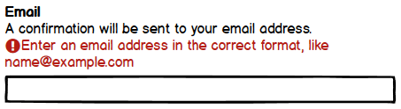
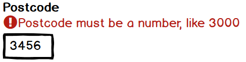
Like many forms, this one needs to validate data entered in many inputs. When creating wireframe symbols for text inputs I included visual elements described in my post: upgrading form validation messages. As shown above, in my text input symbol I expose and position an error message above the input. I do not follow Google’s Material Design for text fields which places error message below the input. Adrian Roselli and Adam Silver both published compelling arguments for positioning error message above the input.
Placing an exclamation icon before an error message provides an additional visual cue. This benefits users who experience limited colour vision or are not able to see colour well. Bake in accessibility at the wireframing stage to streamline it in subsequent stages. Improving accessibility becomes easier when decisions have been made early on. I colour the icon and error message in a red we all can use. When text is large enough this colour combination passes the direct sunlight simulated test. Colouring text in Balsamiq can be achieved via mark-up such as:
{color:#B61D14}Enter an email address in the correct format, like name@example.com{color}Varying text input width via symbol instance properties
Most text inputs in the form use a full width box. However, setting input width to guide sighted users is advantageous for answering postcode, phone, and hours per week which have a known maximum length. Using the same symbol I narrowed the input box width by overriding properties of the symbol instance.
Simulating entering long answers on a mobile
Stakeholders may find it difficult to imagine what it would be like to fill out long answers on a mobile. Show them by simulating the experience in an older model phone.

Showing a label, a validation message, a 5 line text area and a virtual keyboard within a mobile device frame exemplifies the importance of concise microcopy, prioritised content and use of negative space. It also indicates what the experience might be for users completing the form using a mobile.
In this form, none of the questions for long answers have hint text. So the symbol I created for multi-line text input includes:
- label
- validation message
- 5 line text area
Symbol use
My wireframes contained:
- 6 instances of the single line text input symbol
- 9 instances of the multi-line text area symbol
For efficiency and consistency, it was clearly worthwhile to create 15 instances of these 2 symbols.
Balsamiq comes with a range of device containers. Smartphone frames can stretch to fit content users would scroll for. I layout symbols and elements in smartphone frames. Where relevant, I’ll add a virtual keyboard. Scaling up the design to larger screens and physical keyboards can come later.
Communicating intent
Form flow can be achieved via linking from one wireframe to another. I created forward navigation via a primary button at the end of each step. Most form wizard steps include a back link for navigating to the previous wireframe. When I Export to PDF I select to include wireframe notes on each page and show hints that links will operate as expected. Check out my wireframe form wizard (PDF).
Wireframing form wizard patterns
This project introduced several novel elements in my work on form wizards. I created an opportunity to design for mobile first. Patterns new to me in this project include:
- multi-line text areas for long answers
- a check your answers page
- a save your progress and resume later option

Check your answers pattern Save your progress and resume later
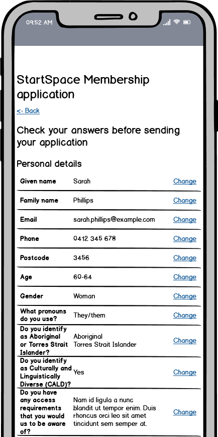

Wireframing these patterns and creating symbols gave a clear overview of the user flow. It also became obvious which symbols could become reusable components. I was very pleased that wireframing enabled me to bake in accessibility from an early stage.
Summary
Wireframing before coding helped me realise efficiencies and opportunities for better form flow. For example, after duplicating the Application in progress screen, only a few adjustments were needed to make the Application complete screen.
Assuming all questions and answer options must be in the final form wizard, wireframing helped me recognise 2 things I would do differently:
- 11 options in a radio group for a user to select their age bracket feels unwieldy. I would investigate alternatives such as:
- an accessible autocomplete component to let users easily filter a list of options by Adam Silver
- a better custom select element by Julie Grundy
- Instead of a single check answers page immediately before the confirmation screen, I would insert a check answers page after each major section
I learnt how to wireframe with Balsamiq and honed my form wizard design processes. Wireframing also made it easier to communicate the design intent of each component and page.
In my next post I’ll share what I learnt about coding this as a form wizard.
Related resources
- Wireframing with Balsamiq Mockups (free course on Udemy)
- Form Fields with Labels (symbols for Balsamiq)
- Form Design Patterns book by Adam Silver
- How to use wireframes with design systems
- Help users to check answers – pattern in the GOV.UK Design System

