It’s a small win to fix your LibCal interface just by adding a few lines of CSS. This popular library software handles bookings for equipment and spaces. By default, the public time grid uses cell colour (with a corresponding legend item) to indicate availability status in each time slot. In this post I’ll describe how you can add a stripe pattern to just one status. This will fix the interface for sighted users, particularly those with a red-green colour blindness.
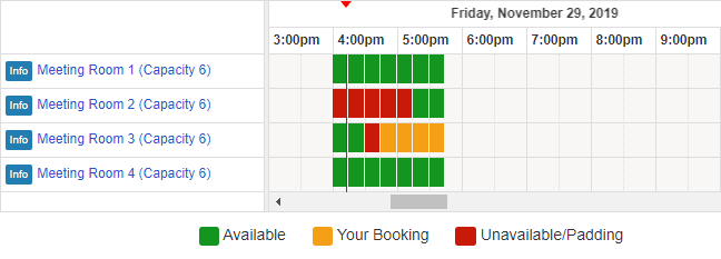
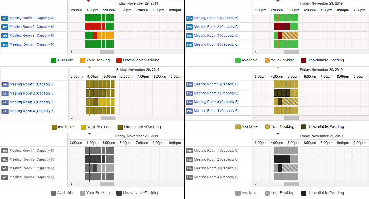
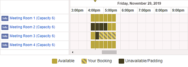
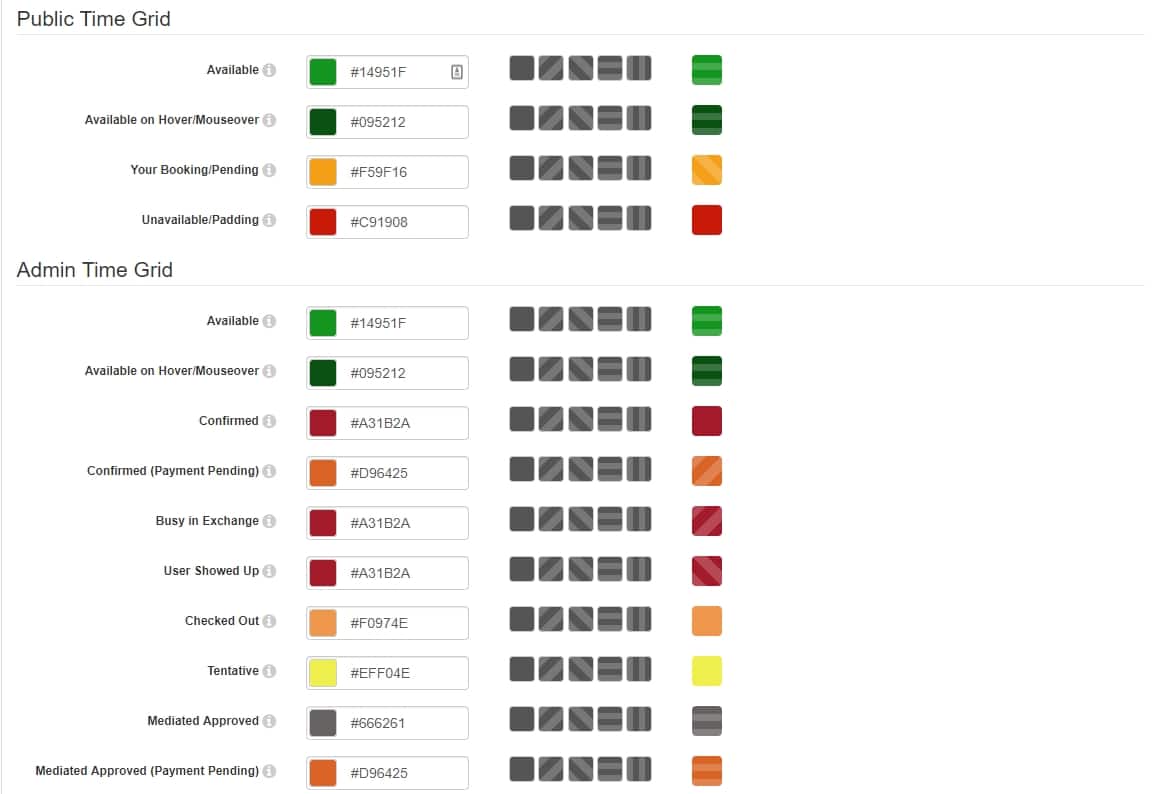
The screenshot above shows the public time grid with cells in default colours indicating:
- available in green
- your booking in yellow
- unavailable in red
These colour combinations may not be an issue for users with regular vision (trichromatic). However, “The most common type of color blindness makes it hard to tell the difference between red and green.” (Types of Color Blindness)
A pattern fix
Adding a pattern to a colour fill is a technique applicable to situations such as a bar chart or a grid of coloured cells.
The objective of this technique is to ensure that when color differences are used to convey information within non-text content, patterns are included to convey the same information in a manner that does not depend on color.
Using color and pattern
Implementation
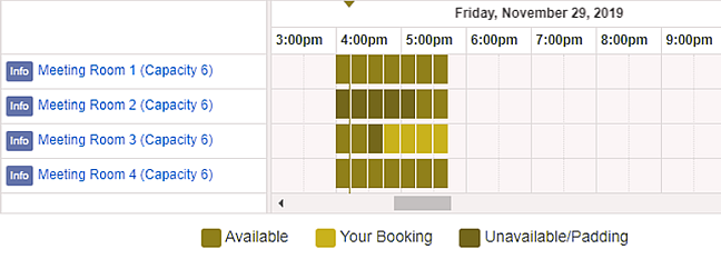
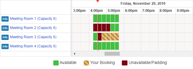
You can easily add a stripes pattern with the following CSS. Log in to the LibCal Admin Interface and head to the Look & Feel settings. Under the Code Customizations section:
- type
<style> - copy everything below and paste it in
- type
</style>and hit the Save button.
See the Pen Fix the LibCal interface with stripes for Your Booking by Vernon Fowler (@vfowler) on CodePen.
Results
If you have plenty of scope, consider prototyping a more accessible redesign of the room reservation experience. In the meanwhile…
Ask your LibCal admin whether your users want a small win and fix the interface with 30 seconds of effort.
Everyone who uses @springshare‘s LibCal should add @vfowler‘s css, which fixes a red-green colorblindness issue in the room reservation system: dropbox.com/s/h2y…wuq/fix-color-alone-convey-availability.css
Before/after comparison attached. Live at calendar.lib.unc.edu/reserve/davis-hub-cubes
#libux
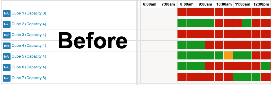
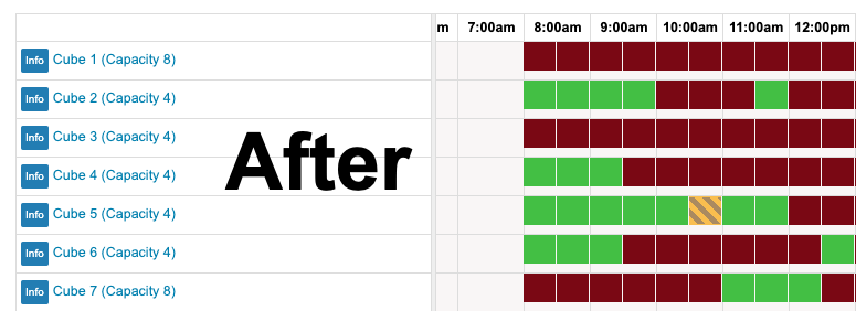
Thank you Chad Haefele for promoting this, fixing the LibCal interface at University of North Carolina Libraries, tweeting before versus after screenshots and asking SpringShare to consider implementing a stripes pattern in their product.
LibCal update is a fix for staff users too
Using color and pattern is an appropriate technique in this situation. This technique means no interface layout change is needed. It ensures “color is not used as the only visual means of conveying information”, complying with WCAG Success Criterion 1.4.1: Use of Color.
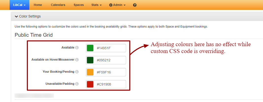
Implementing the fix above ensures room availability status “is also conveyed using patterns that do not rely on color”. While the solution successfully patches the public interface, sadly this would not apply patterns in the admin interface. Staff with colour blindness continued to suffer.
Springshare, the LibCal software vendor, have responded with a fantastic fix for both the public and staff user interfaces.
Well done LibCal team! This gives sighted users equal access regardless of any colour vision deficiencies. My solution is no longer needed. That’s a win!

