At Coles in September 2023, I participated in a programme-wide hackathon to solve problems in a delete flow. It was exciting to contribute innovative concepts, flow diagrams, and a high-fidelity prototype, to articulate a future state flow that puts users in control.
Delete flow case study – Figma slide deck
Background
Promotions at Coles supermarkets throughout Australia are planned and managed behind the scenes by dozens of Business Category Coordinators using a spreadsheet-like desktop-designed web application. Unlike single-category promotions, cross-category promotions include items from multiple categories – multiple coordinators plan and manage them together.
Problem
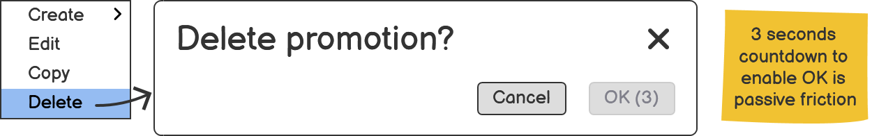
To delete a promotion, a user must wait 3 seconds and then click OK.
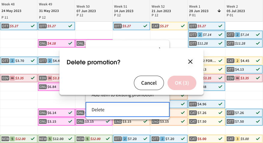
After confirming, the user sees a “Delete successful” status message.

For cross-category promotions, the delete flow was the same as for single-category promotions. This poses problems.
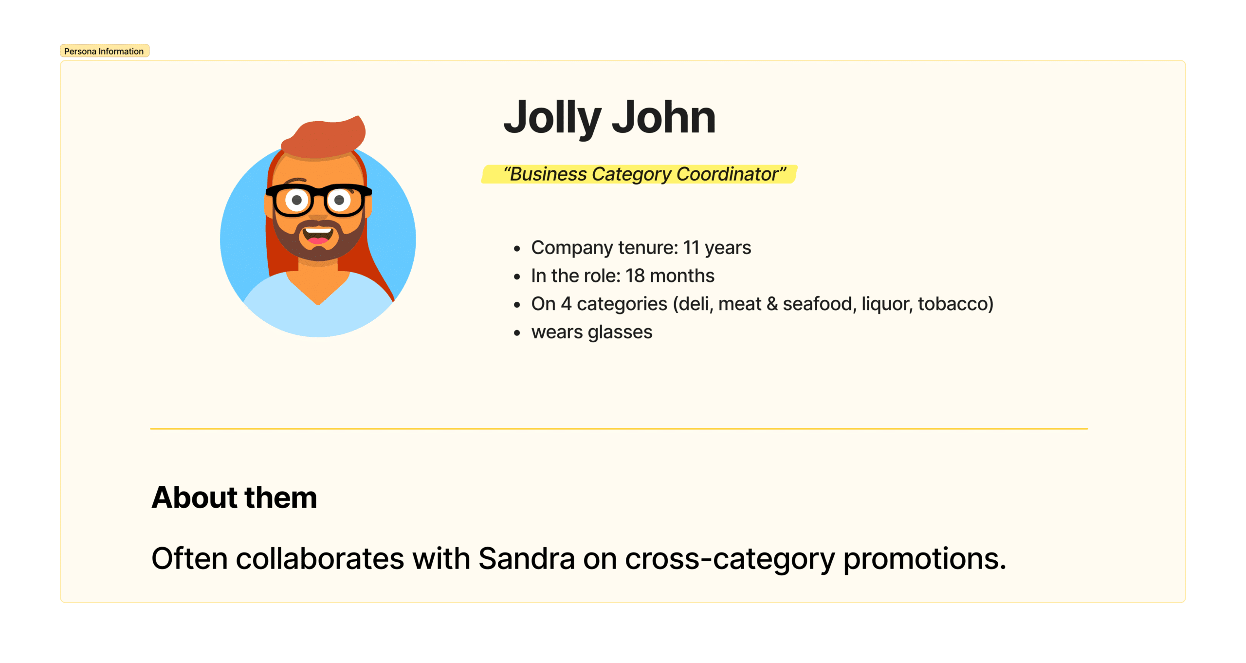
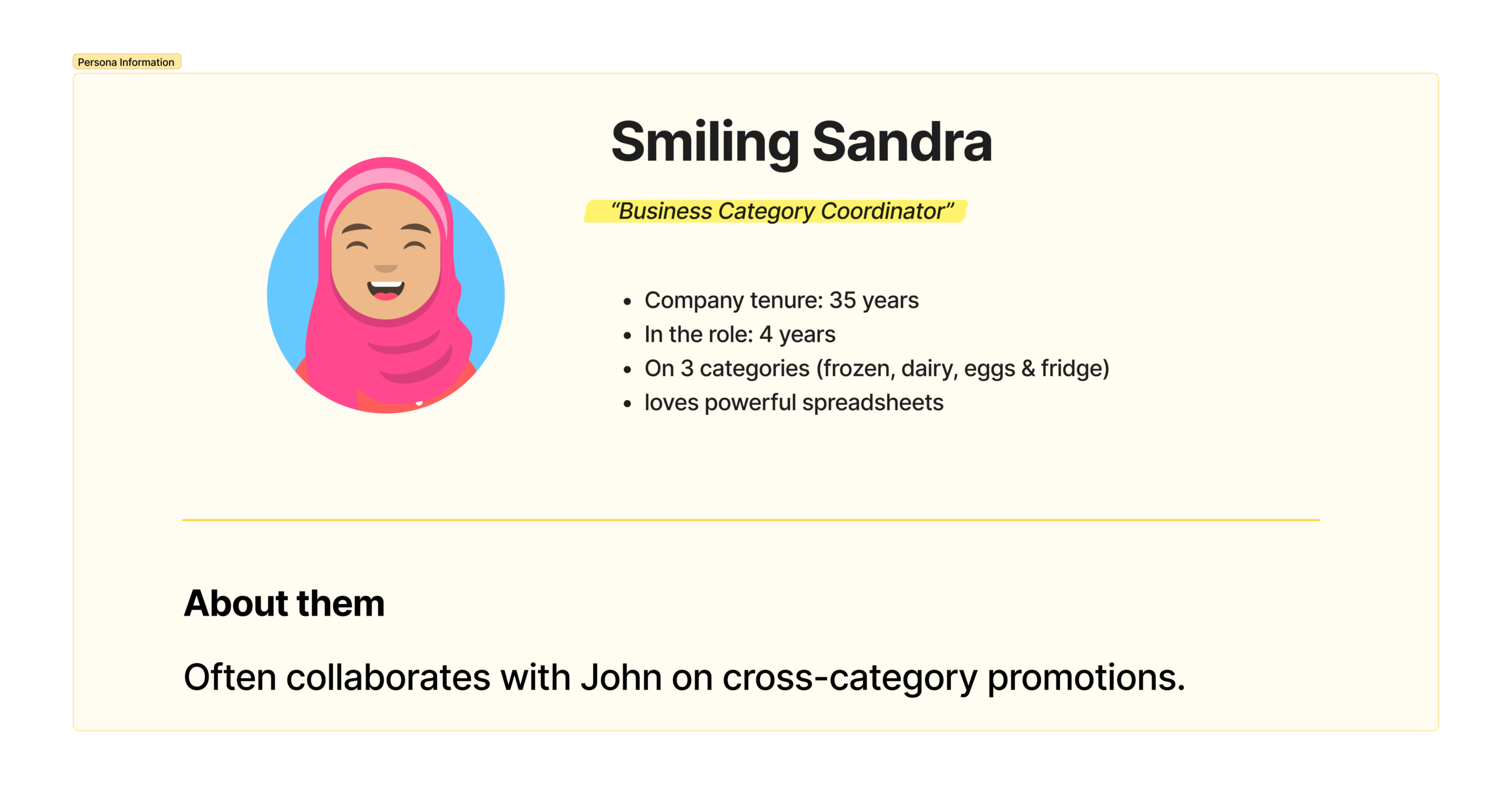
I workshopped with subject matter experts in our team to build a shared understanding of two users and their pain points.
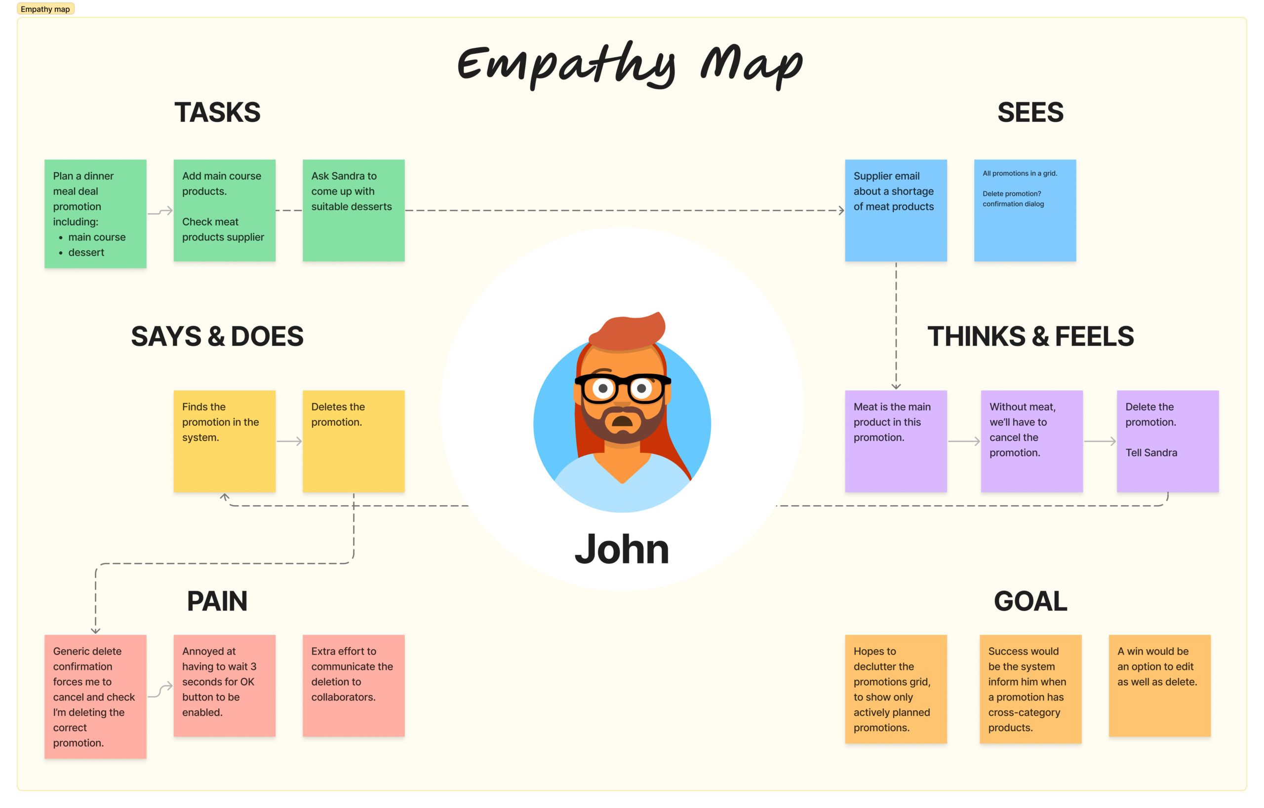
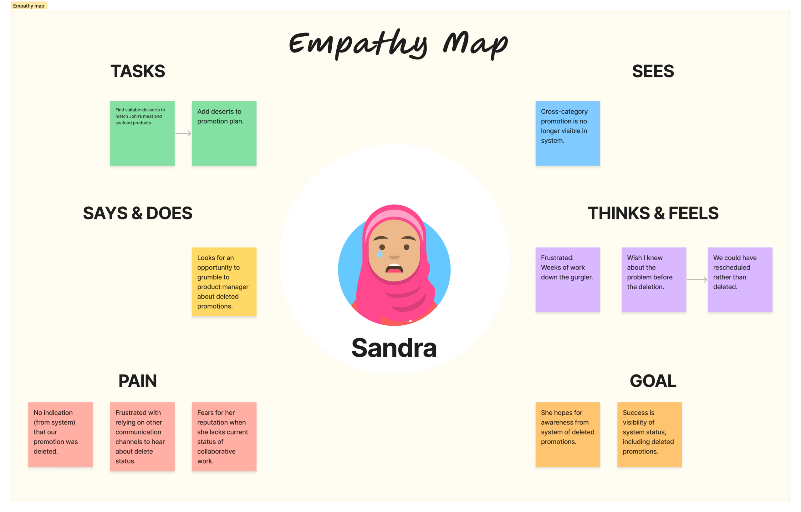
Pain points summary
- The generic delete confirmation causes uncertainty and does not support the user with timely relevant information.
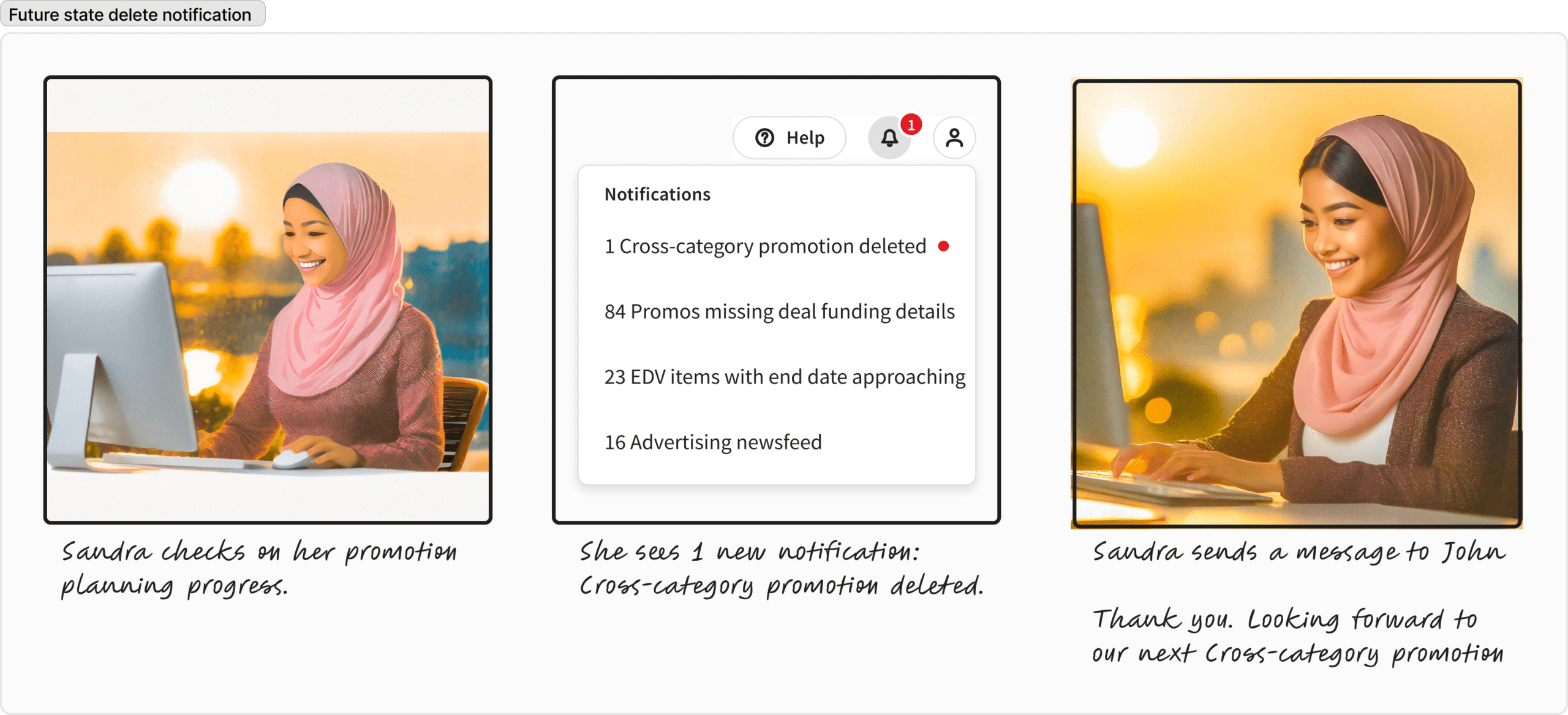
- Collaborators are unaware of deleted cross-category promotions and do not know why their efforts have vanished.
Their pain points helped define our problems to solve.
Problem statements
The delete flow process for cross-category promotions involves at least two users: the user who is deleting; and collaborators who contributed to the promotion. Hence two problem statements.
We believe that providing an informative confirmation dialog
For coordinators deleting a cross-category promotion
Will inform them of additional categories in the promotion, and give them control to edit the promotion
We will know this to be true when we see clickstream data for opening the informative dialog, button to edit or delete the promotion.
We believe that providing in-app notifications
For collaborating coordinators with promotions deleted
Will achieve awareness of the deletion
We will know this to be true when we see clickstream data for marking the notifications as read.
Research
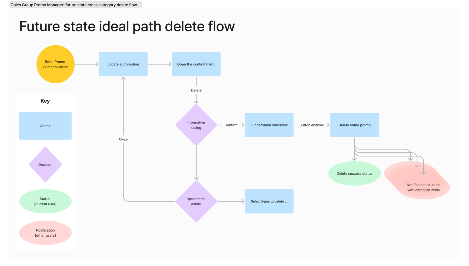
To align our team’s understanding of the problem, I mapped out the current delete flow shown below. Once visualised, our team agreed this process works only for single-category promotions.
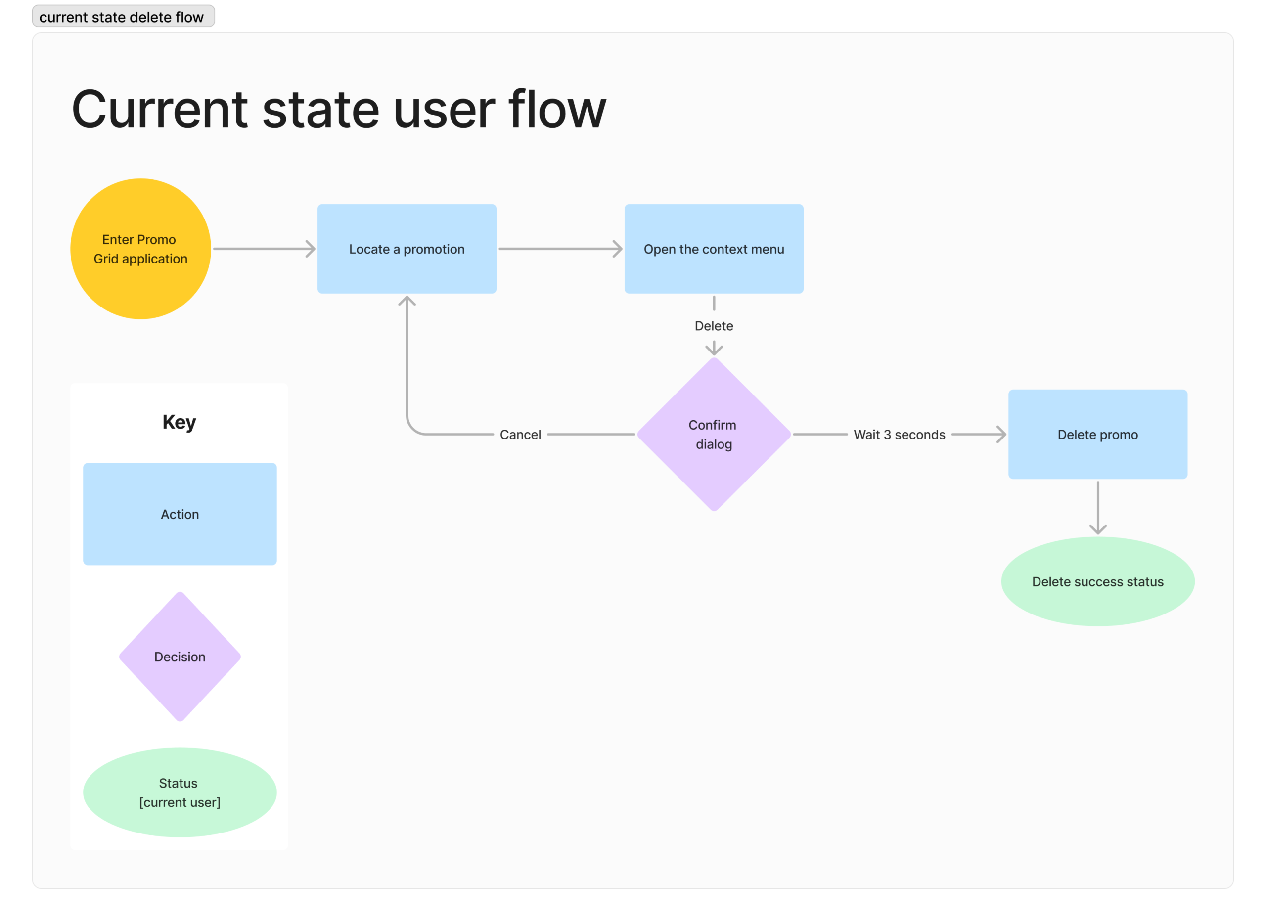
This flow diagram also made it clear where in the process to generate ideas for charting a new course. Our scope for the hackathon was to create a separate experience when deleting a cross-category promotion such that users are informed and aware.
Benchmarking UI patterns
We wanted to improve on the annoying interface pattern of disabling the OK button for 3 seconds.
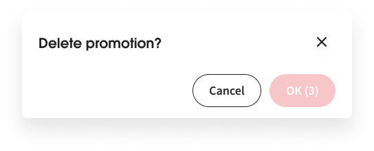
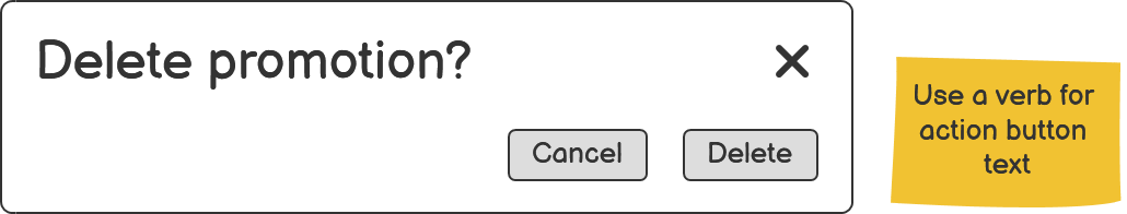
I felt it important to switch to an active friction mechanism… A mechanism that requires more interaction than clicking “OK”. This delete action will destroy the work of multiple people. In addition to labelling the button what it does 1, the dialog content could benefit from clarity. I led a team wireframing session to generate ideas.
Low-fidelity wireframing gave us the freedom to explore concepts for an active friction mechanism. After wireframing and critique, our team was satisfied with the content and interaction design for an effective confirmation dialog.
Solutions
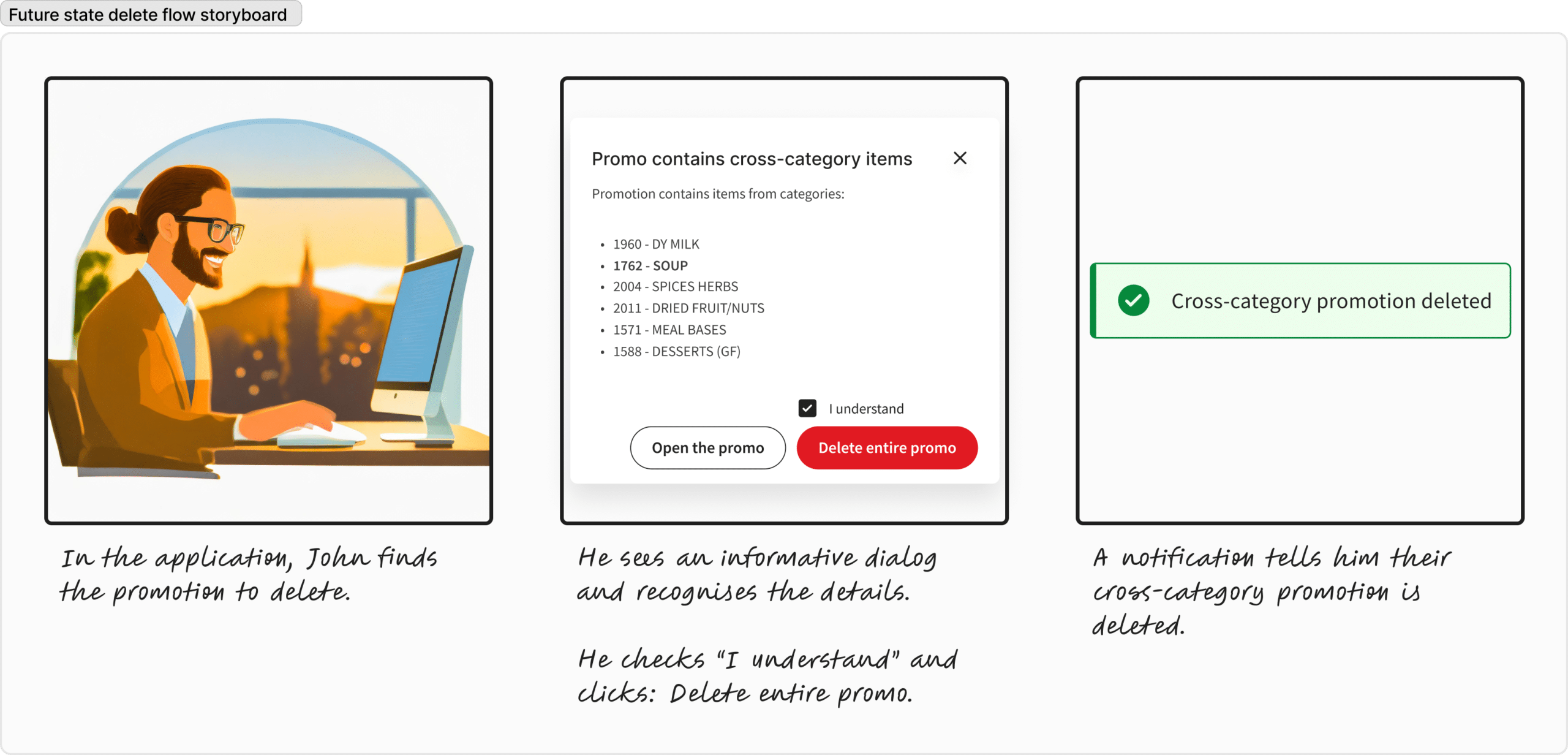
Our new experience solutions are illustrated in the future state ideal delete flow.
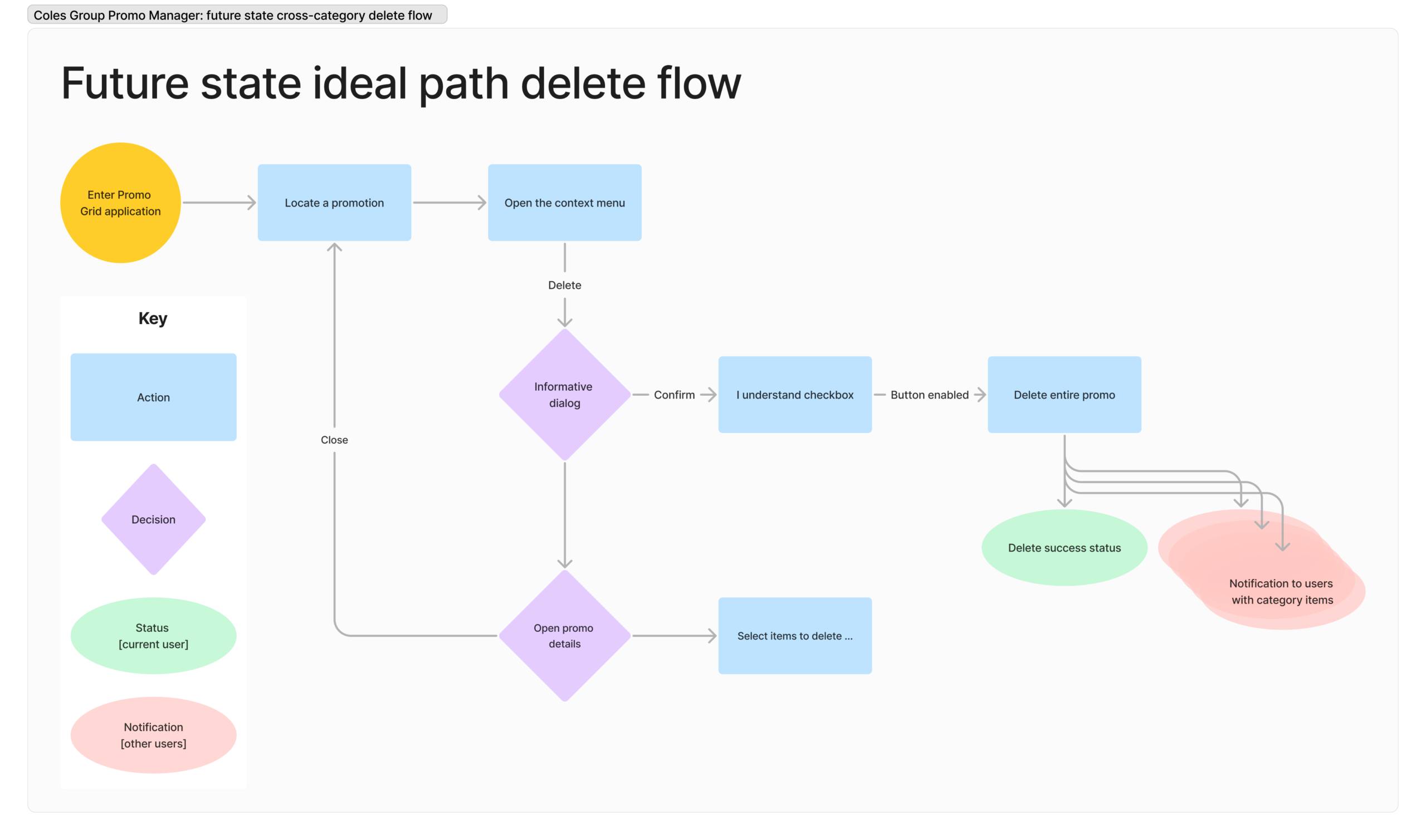
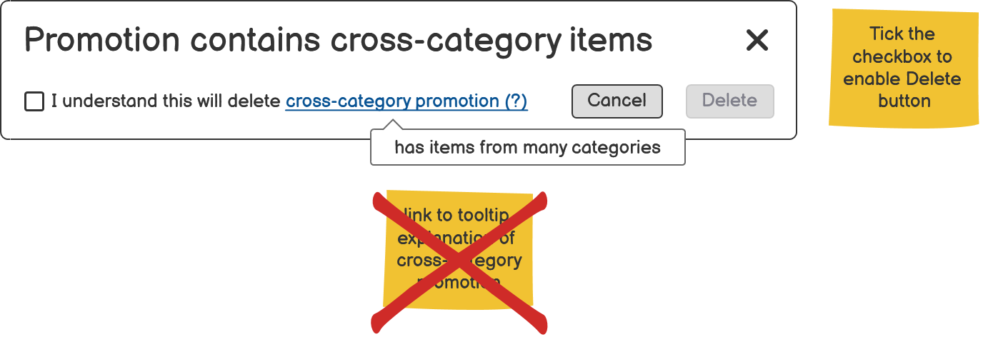
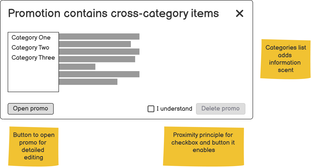
First, I upgraded the confirmation dialog to an informative decision point, offering helpful paths.
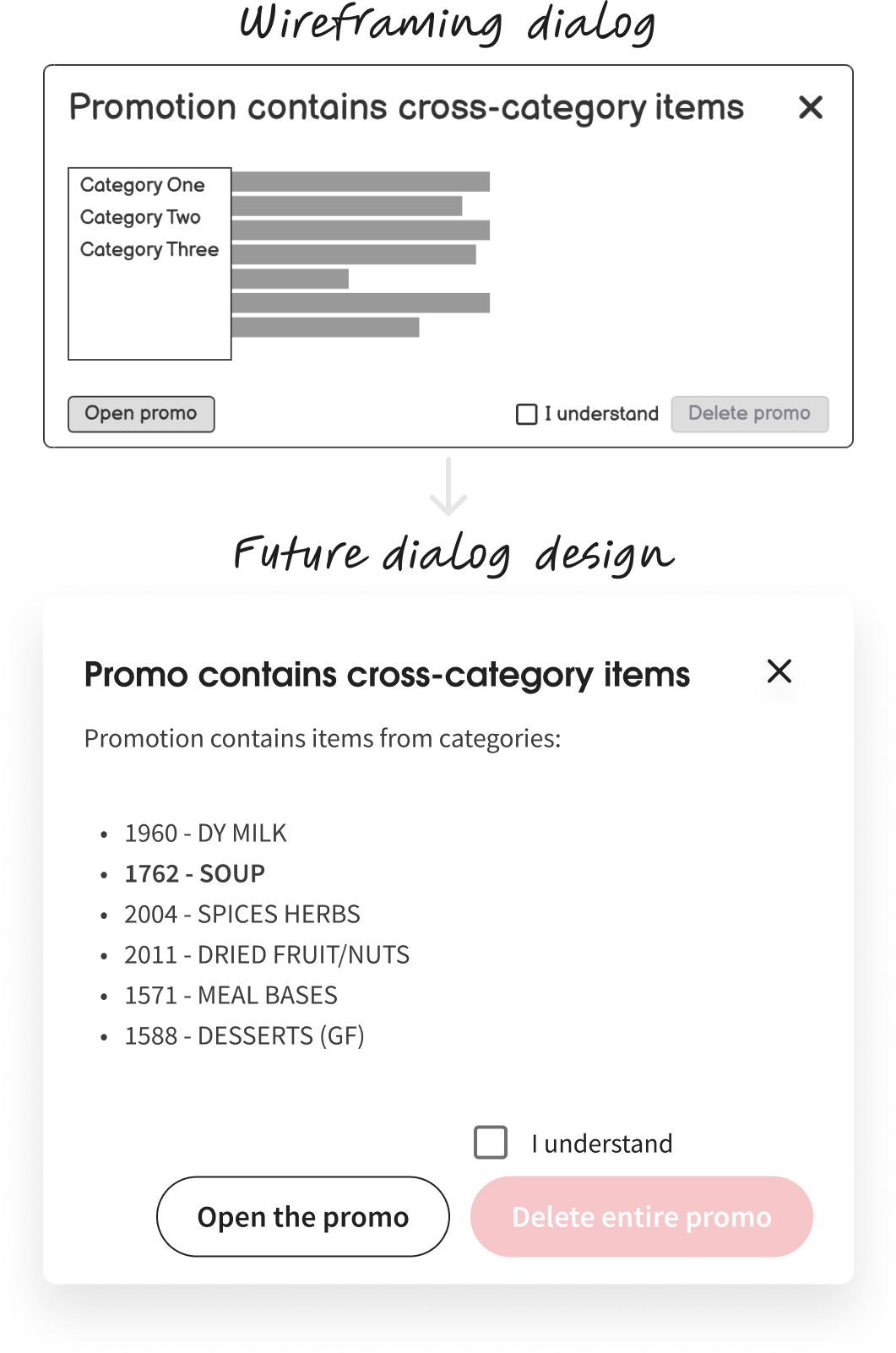
I rewrote the heading as a simple statement and filled the body with a list of promotion item categories.
Then I swapped the redundant Cancel button to one that opens the promo for editing. In this context, it gives the user a helpful alternative flow.
Next, I replaced the delayed OK button with my checkbox-button combo to confirm the deletion.
Last, I wrote a success message suited to the action. To inclusively indicate success, I added a tick icon to complement the green colour.
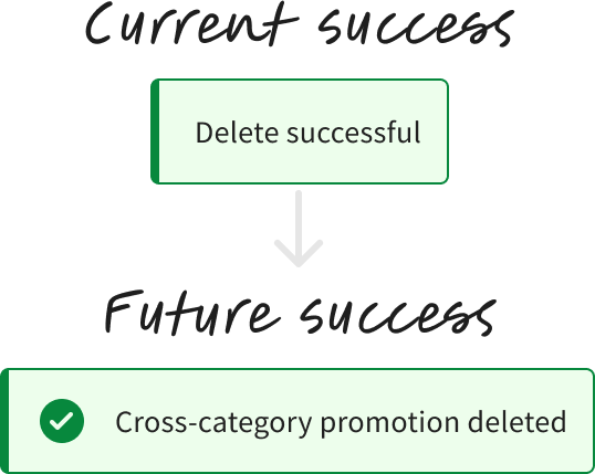
Implementing the notification, I followed guidance from Heydon Pickering’s Inclusive Notifications 2.
- The tick icon is decorative and has a null text alternative.
- The notification message automatically disappears after an appropriate amount of time.
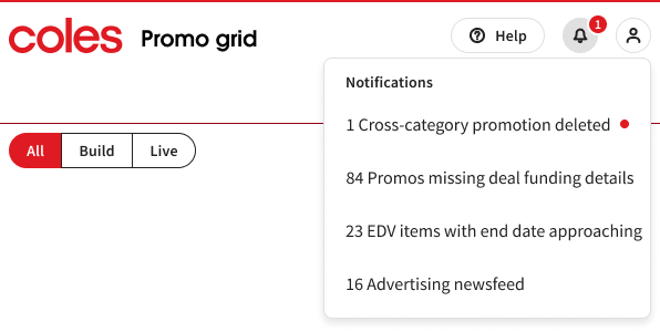
Second, we hypothesised that providing in-app notifications could alert collaborators that a promotion has been deleted.
For this scenario, I used an existing design system pattern:
- A number badge indicator on a bell icon menu button.
- A menu item with the count of promotions deleted.
Results
My accurate flow diagrams ensured that each interface element and state was captured, and all roles in our team were aligned. The delete flow’s future state has additional elements that represent notifications for collaborators. It’s possible that this holistic multi-user perspective gave our team an edge in winning the hackathon.
Our team developers reviewed the current and future state flow diagrams and understood that logic would be required in the Delete context menu item. Based on the condition of the selected promotion on the grid, the appropriate dialog would be triggered.
New paths proposed in the future state will put users in control and empower them with relevant, timely information. The explicit button text makes it clear that this action will delete an entire promotion, including items from multiple categories.
The success notification provides visibility of status, Jakob Nielsen’s #1 usability heuristic 3. Adding an icon gives extra visual affordance and a text alternative, aligning the notification with design standards and further building trust. Our solution also extended a notification to collaborators affected by the delete action.
I connected high-fidelity mock-ups into an interactive prototype for hackathon judges to realise the intent of the proposed delete flow. To explore the prototype, try the promotion in week 50 row 3.

