An accessible video component should come with a transcript to meet WCAG Success Criterion 1.2.8 Media Alternative (Prerecorded). In this post, I’ll describe pain points in the current experience of transcripts in the Single Digital Presence video component 1. I’ll then present an alternative design that addresses these issues. Last, I extended the design to accommodate transcripts in more languages, including right-to-left scripts such as Arabic.
Problems with the existing transcript experience

The Single Digital Presence video component has a link to view the transcript. A link to the transcript is a sufficient way to meet Success Criterion 1.2.8 Media Alternative (Prerecorded). However, people who click to view the transcript navigate away from the current page to a generated transcript page. Navigating away from the video to a new resource is the first problem.

a link navigates the user to a new resource, taking them away from the current context
— Marcy Sutton, Independent web developer and accessibility advocate
Additional problems on the generated transcript page are:
- No context from the origin page
- No link to navigate back to the origin page
- Lacking navigation landmarks or you are here indicators
- Missing a heading or statement that the text is a transcript
This transcript experience is disorienting. It also fails expectations of maintaining the context of video media. People are familiar with a transcript appearing alongside the associated video.
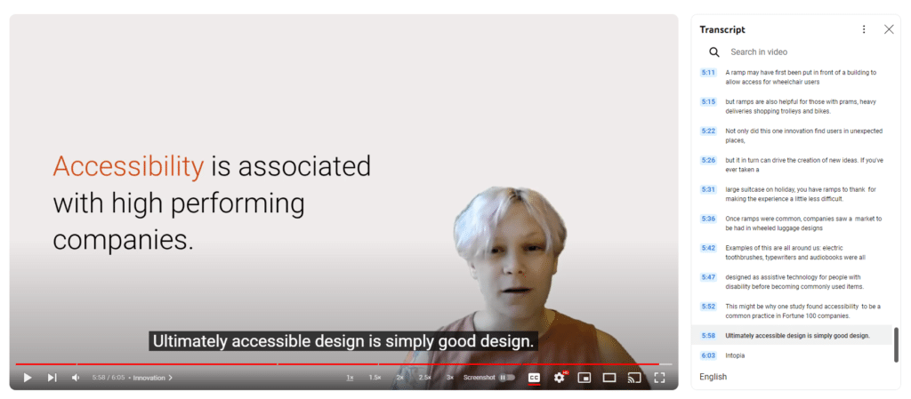
My proposed transcript and video component
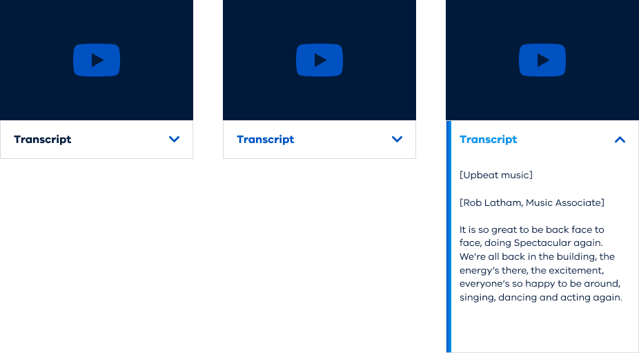
Rather than a link to navigate away, I propose using a button to show or hide a collapsible section. This collapsible section placed immediately after the video would be like accordions in Single Digital Presence. But, a toggle to open all / close all accordion sections is redundant when there is only one collapsible section. In the common case with one transcript, the collapsible section is next to the video.
This design addresses all the issues outlined above. Further, it improves the transcript experience as it:
- Maintains context – including any video playing
- Includes a heading that the following text is a transcript
- Is a familiar interaction pattern to expand or collapse a section
More transcripts for more languages
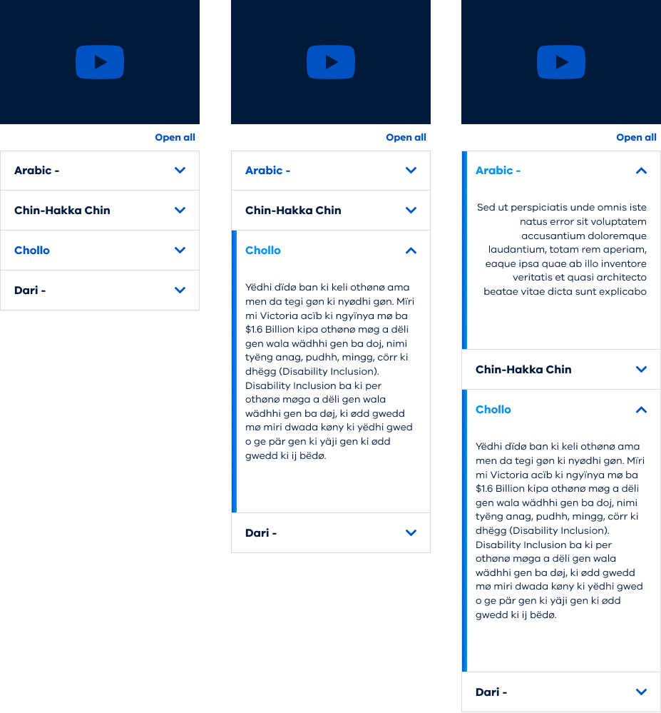
Sometimes we have 28 languages of transcripts with a video component. A toggle to open all / close all accordion sections should be shown for two or more transcripts. For other languages, there are 1 or 2 HTML attributes each accordion section needs:
langattributedirattribute is needed for languages written from right to left
For instance:
<div lang="ar" dir="rtl">
...transcript content goes here...
</div>
Using the lang attribute and correct ISO code for each transcript enables screenreaders to invoke correct pronunciation 2. It also gives compliance with WCAG Success Criterion 3.1.2 Language of Parts.
In addition, to display transcripts with a right-to-left written language, component styles should include the following CSS.
[dir="rtl"] {text-align: start;}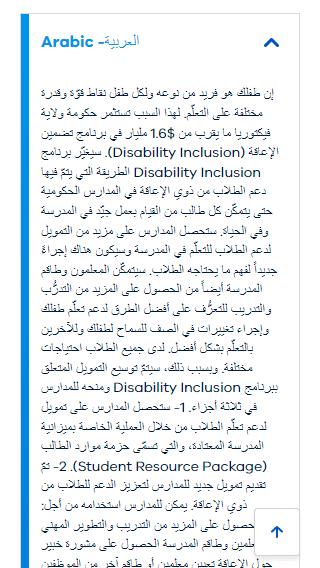
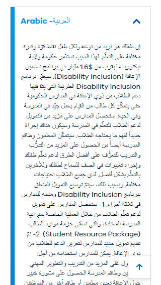
text-align: start; aligns right to left languages to the right margin.Takeaways
1. An accessible video component should have a transcript to meet WCAG Success Criterion 1.2.8 Media Alternative (Prerecorded).
2. Rather than a link navigating away from the context, using a button to show or hide a collapsible section next to the video material is a better way to display the transcript.
3. For multiple language transcripts, HTML lang and dir attributes should be included, along with CSS style text-align: start; to correctly display right-to-left languages.
Summing up
I proposed these changes to transcripts for the video component in the Single Digital Presence design system. The existing transcript link navigates away from the context, producing a disorienting experience. Using collapsible panels and accommodating more languages improves the video component design. It gives familiar interaction patterns and an inclusive transcript experience.
What else might improve the component design or the transcript experience? How might we make it easy for Content Management System editors to add the language attribute to transcripts?
Footnotes
- https://www.vic.gov.au/basic-text-component-formatting-options#embedded-media ↩︎
- Using the correct ISO language marker matters, Nicolas Steenhout, https://nicsteenhout.substack.com/p/using-the-correct-iso-language-marker ↩︎


Great article
Hand coding these HTML attributes is prone to human error. I used copy and paste from this list of language codes to mitigate typing mistakes. Feel free to use this list for transcripts and any text in part of, or for the whole page.
