
You are here indicators help orient people as they explore a website. Yet “many websites need stronger location indicators” 1. People feel lost when looking at navigation menus that all appear similar. The current page should appear distinct from all other menu items in navigation menus. In this post, I describe a visual you are here signal for the current page in local navigation menus.
Shown below left is how menus appeared in Single Digital Presence. Many Victorian government websites use the Single Digital Presence platform. I proposed adding an underline to the current page menu item. It would visually distinguish a you-are-here signal because all other menu items have no underline. Furthermore, indicating the current location within navigation bars is sufficient to meet WCAG 2.4.8 Location (Level AAA)2.
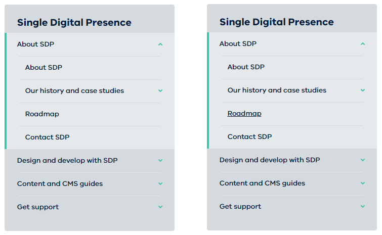
CSS to show you are here
The CSS I put forward:
.rpl-section-menu [aria-current] {
  text-decoration: underline;
}
The unique menu item link is already using the aria-current attribute3. Screen readers will announce this link as the current page. Yet sighted people need a distinct visual style on the current page link to differentiate it from all other links.
I collaborated with colleagues working on the Single Digital Presence platform to implement this improvement. They added my recommendation to the backlog, prioritised it, and implemented it.
Now that the current page menu item is distinct, sighted users will feel less lost. This solution was rolled into navigation menus in the Ripple Design System. This means all centrally hosted websites immediately gain the improvement. In time, independent websites may upgrade to reap the benefits too.
My first contribution to the design system improves navigation. Adding a visual indicator was grounded in the inclusive design principle of providing a comparable experience. Both screen reader users and sighted users now have a current page indicator. Help people orient themselves when visiting a website is a significant improvement to site navigation and user comfort.
Footnotes
- Navigation: You Are Here – NN/G https://www.nngroup.com/articles/navigation-you-are-here/
↩︎ - Understanding Success Criterion 2.4.8: Location (Level AAA)
https://www.w3.org/WAI/WCAG21/Understanding/location.html
↩︎ - Using the aria-current attribute – Tink – Léonie Watson https://tink.uk/using-the-aria-current-attribute/ ↩︎


Ensure #anchor fragments are ignored by whatever backend technology generates your
aria-current=pagefor the navigation menu link. Otherwise the attribute will not be generated and users will be lost in a menu of links.