At the 2019 User Experience in Libraries (UXLibs) conference, themed from research to design, I led a digital prototyping workshop. The case for my workshop was to design an improved mobile experience of reserving a group study room. The aims were to empower participants with skills and confidence to:
- build interactive digital prototypes quickly and easily from low fidelity paper sketches
- test prototypes with users to gather feedback, iterate and implement improvements to digital experiences
- Idea seed
- Insights
- Stories
- Problem statement
- How might we …
- Idea generation shortcut for a 1-hour workshop
- Forming a concept
- Concept to sketch
- Sketching on a mobile template
- Installing the Marvel app
- Creating a Marvel project
- Scanning the sketches
- Linking screens
- My digital prototype
- Testing your digital prototype with users
- Question: digital prototyping fidelity
- Iterating to validation
- Validation to implementation
- Wrap up
- Idea sources
- References
Idea seed
The idea to improve the experience of reserving a group study room stemmed from seeing QR codes on kiosks at Monash University Library. Scanning a QR code to reserve a room in the library leads to a poor experience. SpringShare LibCal has yet to be designed for mobile, and has accessibility and usability issues.
Insights

Issues that are apparent when looking at LibCal on a mobile:
- Unavailable slots are shown. Users can’t reserve these!
- The first 17 rooms are visible but scrolling moves the date time headers off-screen.
- The capacity of each room is truncated from display – it’s impossible to choose a big enough room.
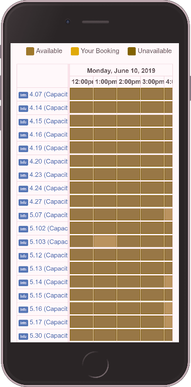
In addition, the colour difference between available and unavailable options lack contrast. People with red-green colour blindness or other colour vision impairments, may find it impossible to distinguish options.
Stories
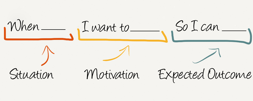
Unlike user stories, a job story adds context (the When _ situation), and focuses on their motivation.
Story #1
When we need to do focus work this weekend
I want to reserve a group study room
so we can collaborate on our group project.
Story #2
When we need to cram for this afternoon’s exam
I want to reserve a group study room
so we can learn together.
Story #3
When our group (7) need to rehearse this evening
I want to reserve a group study room
so we can practice presenting.
Mobile context
Seeing the QR codes on library kiosks, I added further context to each story: that users were using their mobile. Also, from a responsive design perspective, it is logical to start in a mobile context. It is easier to scale up from the narrowest constraint to a wider screen, rather than the other way around.
Problem statement
Framing these insights and contextual stories as a problem statement:
Mobile users struggle to find an available group study room in their desired time-frame.
How might we …
Then I used the following “How might we …” statement to generate an idea.
How might we make it easier for mobile users to reserve an available group study room in their desired time-frame?
Idea generation shortcut for a 1-hour workshop
I had to come up with shortcuts that would maximise participants’ time to focus on new skills. One shortcut I used was to skip idea generation, and provide a single, ready-made concept instead. This went better in the second running of the workshop, where I explained we lacked time to do both generate ideas and build a prototype. (Sorry this wasn’t clear to participants in the first workshop.)
Forming a concept
From ideas, I formed a conceptual model that might answer this “How might we …” question. To determine whether my hypothesis is valid or invalid, I need a prototype and users to test it. The UXLibs conference was a perfect opportunity to broaden prototyping and testing efforts to a large number of libraries.
Concept to sketch
A successful concept must show relevant reservation options:
- In the desired time-frame – users already have a time-frame in mind.
- Only show available options – don’t show options that aren’t available.
- Show options designed for mobile.
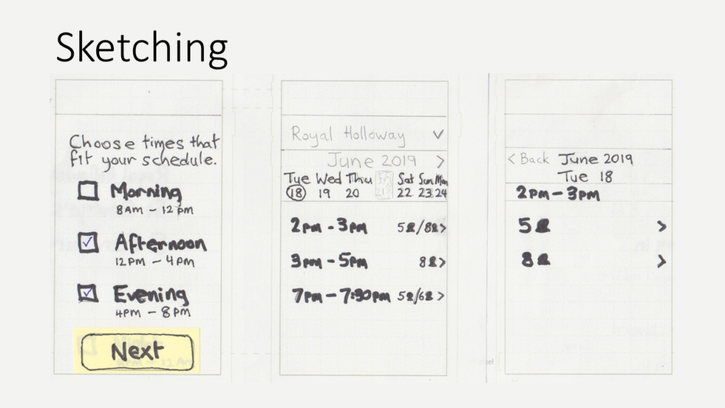
- Time-frame selection with checkboxes allowing selection of multiple options.
- List available times within chosen time-frames. I’ve shown examples with 1-hour duration, 2 hours, and a half-hour – you might choose to use durations based on your business rules. The options also indicate room capacities at those times. Note the default date (Tue 18th) should be the earliest when an available time-slot exists. Also, where there are no available time-slots on a given day (Fri 21st), the day name and date is greyed out. Users can scroll ahead to the following week by using the right
>button. - List room capacity options for the selected time. If users select a time that only has a single capacity option, then this screen is skipped.
The concept addresses issues concentrated into 1 screen of LibCal. I used the one thing per page principle to spread the design to 3 screens. As well as being easier to design, one thing per page reduces cognitive load.
Sketching on a mobile template
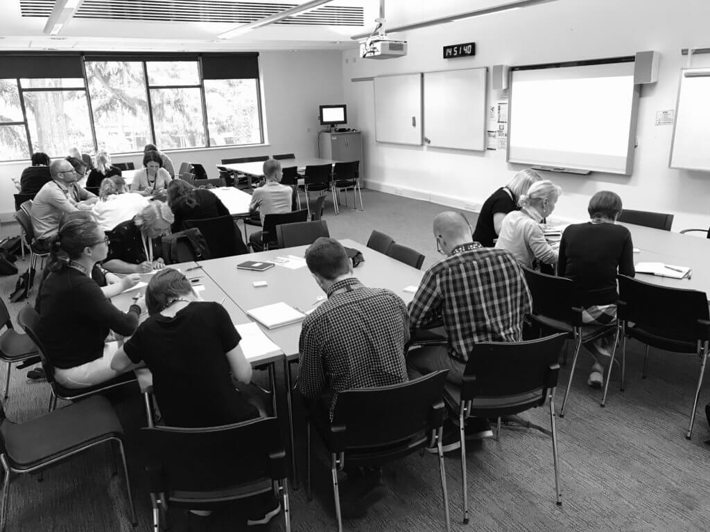
I could’ve provided handouts with my 3 sketched screens but I feel asking participants to sketch by copying from my example slide worked better. It gave them ownership of the prototype they were about to build. To create 3 sketches for a flow, I organised participants into groups of 3 with only 1 screen for each participant to sketch.
Installing the Marvel app
Marvel app is 1 of many prototyping tools you can use to turn low-fidelity sketches into click-through prototypes in minutes. It was selected for the workshop as it has:
- A shallow learning curve
- Mobile apps and a web app for further functionality
- A freemium business model
- An easy way to share and test prototypes
To help participants install the Marvel app, I showed a slide with separate bit.ly short links and QR codes pointing to Marvel for Android and iOS. Only a few participants managed to scan the QR code, and it was worth having some participants 1 step ahead.
Creating a Marvel project
Once participants had Marvel app installed, they were instructed to open it and:
- Create project
- Name the project: Test
- Choose your device
- Add some designs (tap +)
- Choose camera to scan your 3 sketches
Scanning the sketches
After scanning sketches, the ability to resize and crop means it doesn’t matter whether each group participant had a different size phone. I showed 0:26 to 0:39 of Paper Prototyping mit Apps to demonstrate the scanning procedure.
Linking screens

Next, to demonstrate how to link screens into a flow, I showed Paper Prototyping mit Apps 0:39 to 0:54. I listed step by step instructions on the following slide.
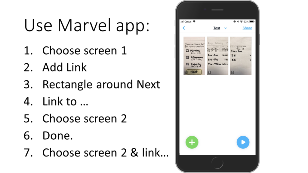
With screen 1 linked to 2, and 2 to 3, now test it for yourself by pressing the “play” button. Some participants also linked the < Back button from screen 3 to 2.
My digital prototype
My finished prototype below includes 2 additional screens. I added both the step before and after. This gives an idea how the interaction fits into the broader flow. It also makes the prototype feel more real.
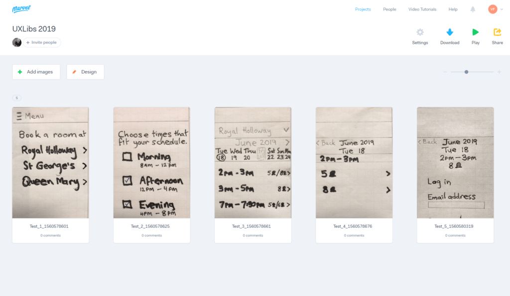
Workshop participants created a single user flow through the reservation task. Using Marvel you can generate a user flow diagram to communicate interaction paths in your prototypes. Although it may be overkill for a single flow path, you may find Userflows handy for more complex digital prototypes.

Testing your digital prototype with users
The point of creating a prototype is to test it with users. Thus qualitative, preferably moderated, usability testing will answer questions such as:
- Can people use the product?
- What ideas do users have to further improve the interaction?
- Is the experience with the prototype measurably better than the existing interface and interaction flow? Experience metrics to evaluate and compare could include satisfaction, task success rate, and a System Usability Score (SUS) evaluation.
It’s also possible to A/B test a digital prototype against an alternative design. To avoid bias, match the fidelity of all variations. To see which design works better, A and B variations need to be comparable. For example, if your prototype is freehand paper sketches, then the alternative should also be paper sketches.
Question: digital prototyping fidelity
An excellent question Carl Barrow asked: When/Should we ramp up digital prototyping fidelity – to crisp ruled lines, rounded button corners, etcetera? Low fidelity, rough sketches are excellent for garnering volumes of rich feedback. The opposite is also true. Hence users feel high fidelity prototypes are so polished that there’s little scope left to adjust anything. Use a level of fidelity relative to where your prototyping is in the design process. Invest in low fidelity prototypes early on. If needed, gradually increase fidelity in each iteration of your prototype, and expect more constrained feedback with increased polish.
Iterating to validation
After prototype testing with 3 to 5 users, we learn some answers to our questions around usability issues, and other useful ideas. Incorporate feedback that will lead to a measurably better experience, into a subsequent prototype iteration and testing round. Then repeat iterating and testing your prototype until you have validated findings.
Validation to implementation
Share validated findings with your vendor/system developers. Your goal from here is to have a pilot developed (with real data and user testing) to see if an implementation will thrive in a production environment.
For example, SpringShare are very open to customer feedback, and more likely to develop a pilot for a reconceptualised LibCal when presented with user testing results from multiple librarys.
While LibCal is popular, it is not the only system for reserving library rooms. Libraries that use alternatives to LibCal could also conduct research, present insights to the vendor (or in-house development team), and seek development of a pilot.
Wrap up
To sum up, while the case for my workshop was designing an improved mobile experience of reserving a group study room, prototyping and testing can and should be part of your design process. I found preparing for this 1-hour workshop a far greater challenge than preparing for lightning talks. Not only did I have to convey a hypothetical design problem from a digital flow that is relevant to libraries, but also to focus on rapid skill development for parts of the design process that I suspected were absent. I hope attendees are now confident to:
- build interactive digital prototypes quickly and easily from low fidelity paper sketches
- test prototypes with users to gather feedback, iterate and implement improvements to digital experiences
Digital prototyping and testing are part of the design process
Idea sources
Ideas for improving room reservation experiences, digital prototyping and testing came from:
- Designing The Perfect Date And Time Picker by Vitaly Friedman
- Appointment Web Forms by Matthew Talebi
- One thing per page by Tim Paul
- Chapter 6: Can people use the product? and Chapter 7: Which design generates better results? in Validating product ideas through lean user research by Tomer Sharon
- Prototyping: Why Bother and Where to Start? A Definitive Introduction by Paul Boag
- Mobile first by Luke Wroblewski
References
Below are links to references cited in the workshop slides:
- Replacing The User Story With The Job Story by Alan Klement
- Marvel sketchpad templates
- Artist Q & A: Why Do You Use a Sharpie to Draw? Pencil or Sharpie? by Draw So Cute
- UX Design Techniken: Paper Prototyping mit Apps by eresultgmbh

1 comment
Comments are closed.