
This post is a written version of a lightning talk I gave as part of World Interaction Design Day #IxDD at the Melbourne Web Accessibility and Inclusive Design meetup in September 2018.


From plastic cards to form wizard
Prior to September 2018, Become a Library member was a single page web form on which I’d led mobile form improvements for better UX. The registration process dumped everyone’s input into a holding bay in a database for manual processing and distribution of a plastic member card. Shifting from plastic member cards to digital distribution methods meant business process re-engineering and converting the single page form into a multi-step wizard.
The wizard design pattern
“a powerful design pattern … to simplify complex processes performed infrequently or by novice users.”
Wizards: Definition and Design Recommendations by Raluca Budiu on June 25, 2017 https://www.nngroup.com/articles/wizards/
Manual accessibility testing
In September 2018 I conducted manual accessibility testing on the first iteration of form wizard and the new self-service join processes. My colleague Janet Austin assisted with the session. Jamie Kelly, a blind person from the Vision Australia Library, was our participant. He tested two scenarios:
- laptop + Firefox + JAWS screen reader → email membership delivery;
- iPhone + Safari + VoiceOver → SMS membership delivery.

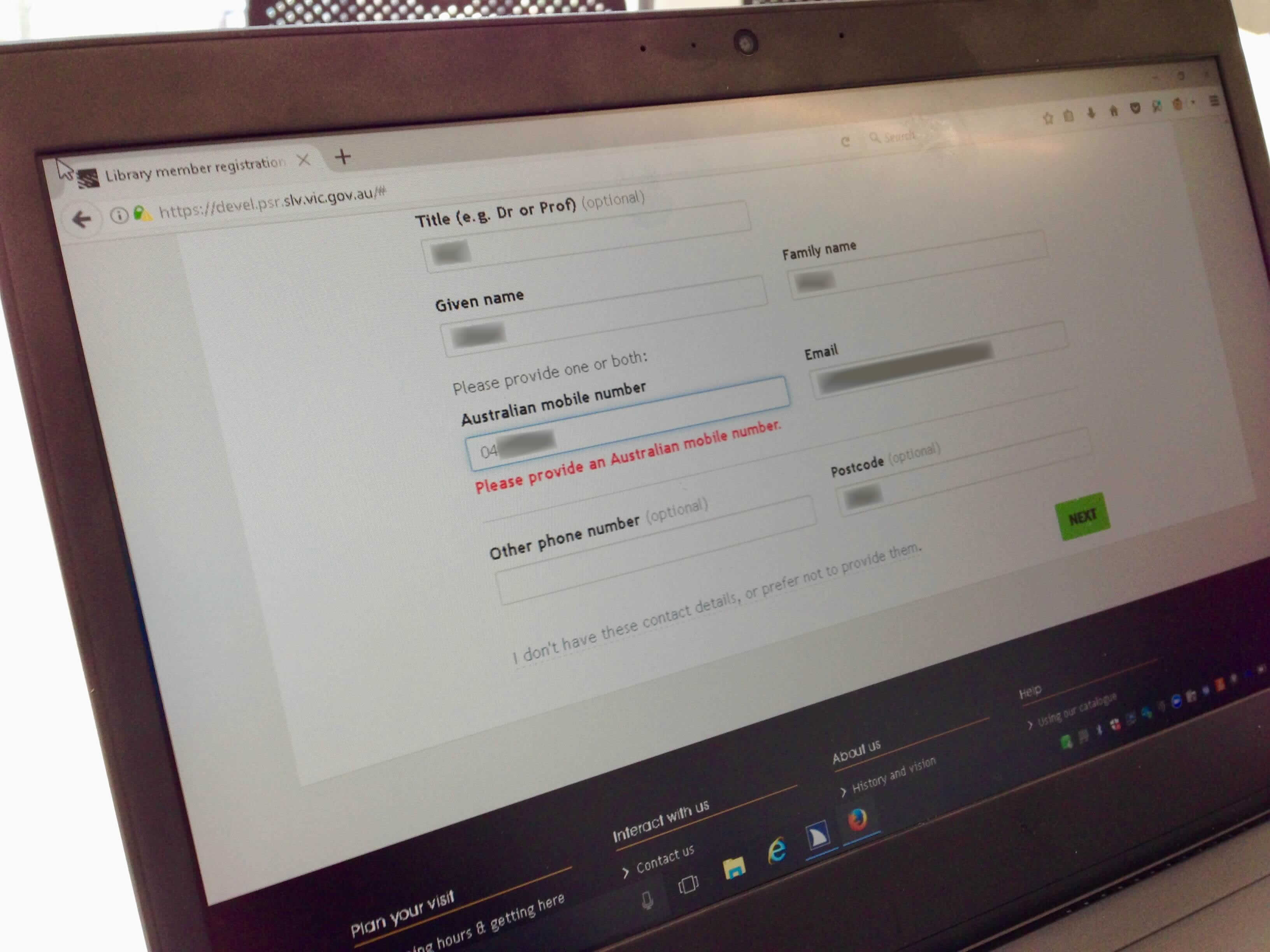
Imperceptible validation
I was shocked that the first show-stopper issue occurred in the first step of the form wizard. A validation message for Australian mobile number appears visually in red text. However, it wasn’t announced by the screen reader. There was no way our screen reader user could discover why the form was stuck on step 1. Furthermore, recovering from the error was impossible.
Progress for all
It’s vital to show your progress, to “distinguish the current step, and how many steps there are left.”
Wizard Design Pattern by Nick Babich on April 8, 2017 https://uxplanet.org/wizard-design-pattern-8c86e14f2a38

We need to provide a sense of progress to screen reader users too. Unfortunately the HTML5 progress bar is not accessible! Scott O’Hara suggests “treat[ing] the progress bar as a visual decoration, hide it from screen readers, and provide visually hidden text as a means to consistently convey the information.” We use the Bootstrap .sr-only class to hide text on all devices except screen readers.
Our participant heard and understood they were making progress. The page title was announced as “Library member registration | Step 2 | State Library of Victoria”. Then this was reinforced by hearing “Progress: 40%”.
Buttons ≠ mental model of radio inputs
At step 2 of the wizard, users must explicitly choose their preferred method for receiving their membership: SMS or email. Each option displays their relevant contact details. So they can check their mobile number or email address for correctness.
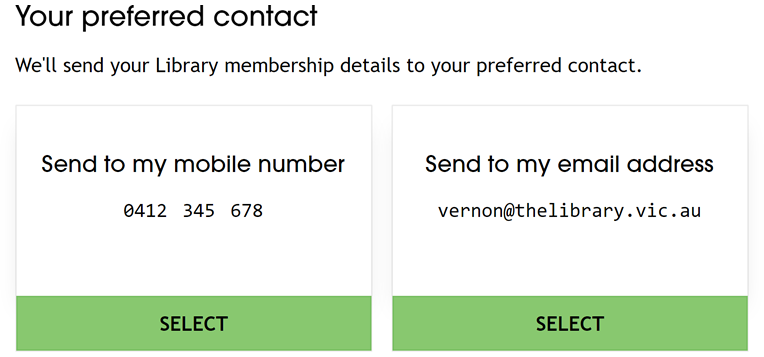
<button type="submit" name="confirm" value="sms"> <button type="submit" name="confirm" value="email">These buttons were the only form controls on step 2. Clicking one of the buttons would indicate your preference, SMS or email, and submit the form to step 3. These buttons completely baffled our participant. We’d focused on making easy interactions with large touch targets for the new kiosk devices. Hence we lost sight of underlying semantics (or lack thereof) and accessible form design patterns.
Our participant pointed out that the buttons really should be radio inputs. Furthermore, lacking an explicit submit button exacerbated the mismatch of conceptual to mental model. The design didn’t align with their mental models of interfaces or flow!
An inclusive design solution for radio inputs
Two days before our testing session, Hui Jing Chen posted Customize Radio Buttons without Compromising Accessibility, an inclusive design solution that makes radio inputs work for screen reader and touch screen users alike.
Log issues and iterate
Lastly, I recommend Eric Bailey’s advice in The Importance Of Manual Accessibility Testing: log issues you’ve identified. Also rate identified issues in terms of user value and team effort, to prioritise which changes to iterate in your upcoming sprints. For our next iterations of the form wizard, we’ll work on fixing form semantics and validation issues.
See the thread at https://twitter.com/vfowler/status/1044468802786922497 for links to references cited.


4 comments
Comments are closed.