
I used form wizard wireframes to start coding a prototype. When prototyping, we scale up from the fidelity of wireframes. This includes a broader colour palette, richer interactivity, further accessibility development and navigation. In this post I share how I levelled up my mastery of tools, sharpened my HTML, CSS, and JavaScript coding skills and extended on accessibility started in wireframing.
The documentation I created greatly benefited my handover conversation. Additionally, coding knowledge I gained helps me recommend improvements for design systems.
First, get an overview of the flow and the structure of the files.
Flow and files
My brief was to design a flow and build a prototype registration form. The purpose of collecting details is to assess applications for a membership program.
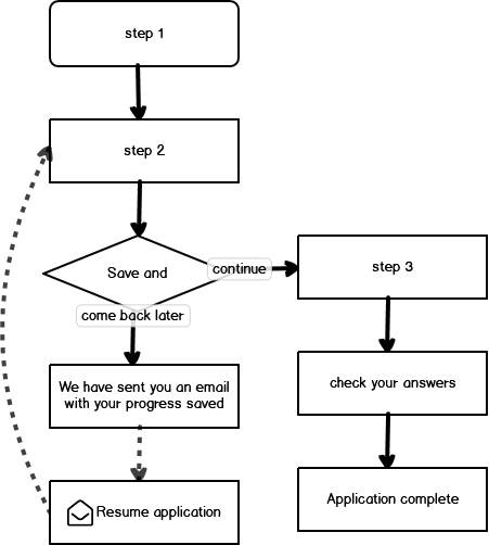
Step 2 asks about your startup or small business idea. Answering these questions may require offline thinking time and collaboration with a co-founder. Here users can save progress and come back later.
Each discreet step in the flow needed its own page in Codepen. I learned that any pen could link to the CSS & JS of another pen.

It suddenly became obvious: I would create all the CSS & JS in step 1 and link them from the other steps.
Colour palette codes for accessible prototyping
In addition to black, grey and white, my wireframe introduced a red we all can use. I carry Thunderbird red into prototyping to help sighted users distinguish error messages. I expand my colour palette to style:
- a minimum grey for input hints
- a blue for primary button background
- a yellow orange for focus indicators
- a green for success
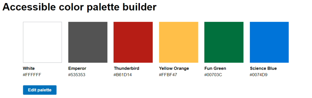
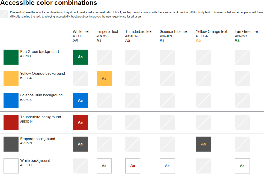
With the Accessible color palette builder we can create up to 6 swatches. Colour combinations with enough contrast are shown below.
More contrast than Science Blue on white
I intended to use Science Blue for text links and the background colour of primary buttons. Science Blue on white achieves a WCAG AA grading with a contrast ratio of 4.67:1. However, Who Can Use tests failed this colour combination for people with cataracts or low vision as well as in night shift mode or direct sunlight situations.
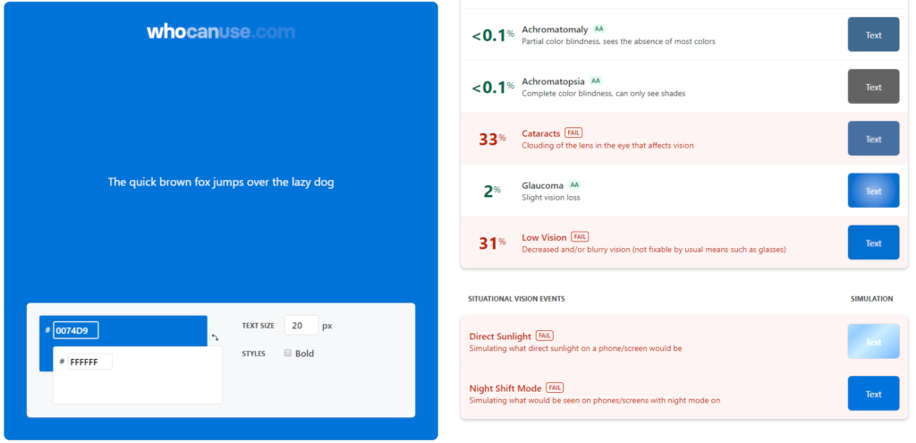
I set Science Blue as my base colour in CopyPalette and look for a shade that will prove better with the Who Can Use tests.
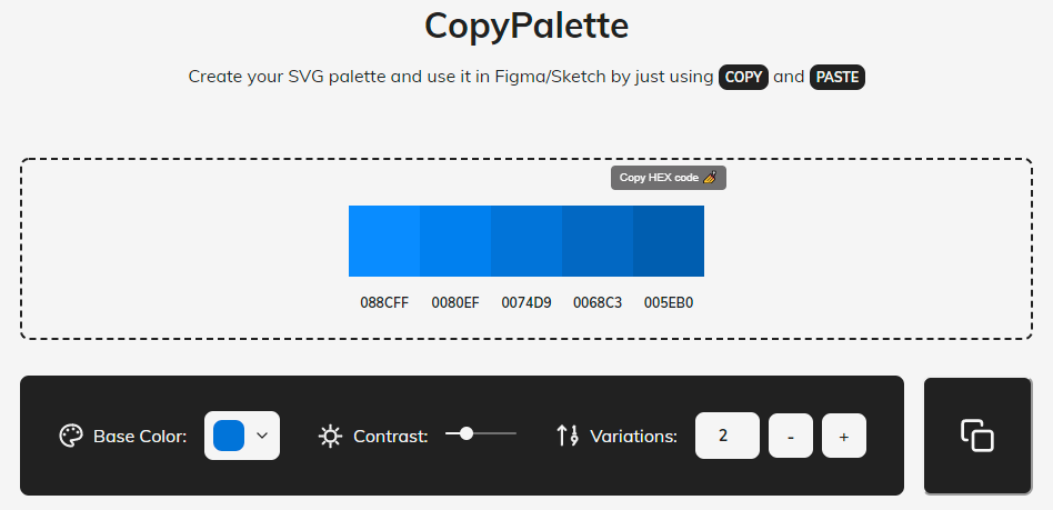
Two shades darker is Endeavour #005EB0 which passes all Who Can Use tests except direct sunlight, a situation that users might be able to address.
Coding contrast for user interface components
In addition to text that is easier to read, I want to ensure user interface components (and states) have a contrast ratio of at least 3:1 against adjacent colours. Form wizards have many user interface components:
- text inputs
- radio and checkbox inputs
- textareas
- buttons and links
These components have several states including hover, focus, active, checked and invalid. I broaden my palette to include colours for borders, and focus rings. I used the EightShapes Contrast Grid to test contrast combinations for my 10 colour palette.
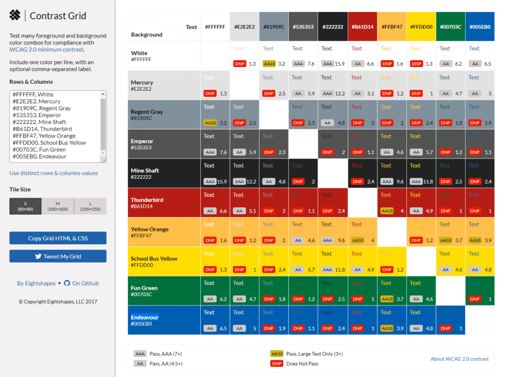
Lack of sufficient contrast … causes barriers to interaction, as users may be unable to identify their location on a page, the state of the interactive elements (links and controls), read text, or identify the content of images. The importance of good color contrast can’t be understated as there are many more people with low vision than there are people who are blind.
Introduction to Web Accessibility | edX
Use URL parameters to reference palletes you create. This makes it easy to document and share with your team.
Where my prototype uses these colour combinations:
- White text on a green background for application complete.
- Grey text on Yellow Orange background has more than enough contrast for a focus indicator.
- White text on a blue background for primary buttons.
- Text will need to be large in this colour combination so people who have cataracts or low vision can read it.
- Red text on a white background for error messages.
Coding colours in CSS custom properties
color names derived from http://chir.ag/projects/name-that-color/
My most valuable lesson came near the end of the wireframing course: Symbols. Creating and using symbols in wireframes brings consistency and speed to creation of interfaces. Inspired by the Form Fields with Labels symbol library and the Form Design Patterns book, I found it useful to create two particular symbols for a registration form:
- Single line text input – including label, hint, validation error and input box
- Multiline text area – for longer answer questions
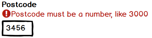
Many inputs need validation. Visual elements from upgrading form validation messages are applicable when wireframing. It is helpful at this early stage to expose and position error messages above text inputs. An exclamation icon precedes each error message, overcoming any reliance on colour alone. A red we all can use colours both the icon and the error message text.
While most text inputs used a full width box, setting input width to guide sighted users is advantageous for answering postcode, phone, and hours per week which have a known maximum length. Using the same symbol I narrowed the input box width by overriding properties of the control.
Designing for long answers on mobile first
Stakeholders and design teams may find it difficult to imagine what it would be like to fill out a long form on a mobile. So show them.

Showing a label, validation message, a 5 line text area and a virtual keyboard within a mobile device frame elucidates the importance of concise microcopy and prioritised content. It also indicates what the experience might be for users completing the form using a mobile.
None of the form questions for long answers have hint text. So the symbol I created for multiline text input includes a label, validation message and a 5 line text area. I used 9 instances of this symbol throughout the wireframes. It was worth the effort to create symbols.
Once form components fit mobile devices with their small touchscreens and virtual keyboards, it’s quick and easy to scale up the design to larger screens and physical keyboards.
Coding
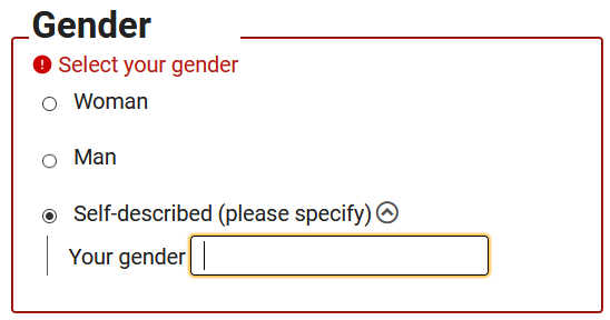
A HTML autocomplete attribute for gender identity
I’ve previously written how identifying input purpose lifts form usability and accessibility. In addition to standard personal information such as name, email and postcode, this registration form asks users to identify their gender.
CSS custom properties
To advance my design skills, I used coding this prototype form wizard as an opportunity to apply some basic CSS custom properties.
Form wizard prototype navigation
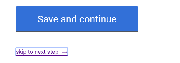
Form wizards use button elements to continue to the next step. I haven’t found a way for submitting a form in Codepen to redirect to the next step. I want colleagues to be able to navigate the prototype so I created a workaround. Similar to skip links, instead of always displaying a link to next step, I hide it until the link has focus. Printing the design will not reveal prototype-only navigation. To aid discovery, I place instructional text near the beginning of step 1.
To navigate steps of this prototype, a link to the next step will be revealed on focus when you tab after a submit button. Back links are visible from step 2 onward. These links open in a new browser window.
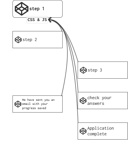
Form wizards can inherit CSS and JavaScript code from a source Pen
Each step of a form wizard is contained in it’s own Codepen Pen. I craft all CSS and JavaScript in the first step Pen. For consistent styling and behaviour across all steps of a form wizard, simply link to the URL of the first step Pen as an External Pen from every other step.
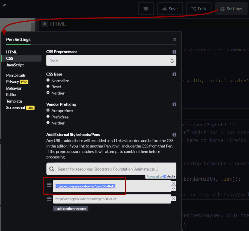
For example, from my step 2 Pen, I set the CSS and the JavaScript to link to the URL of the first step Pen. Colleagues will find it helpful if you comment this into the CSS and JS panes of the editor. For example, in the CSS pane I commented: /* use the same CSS as https://codepen.io/vfowler/pen/BayReEJ */ Once this is done, creating a Fork for additional wizard steps will retain the External Pen links and the CSS and JS comments.
JavaScript to show/hide an input for more details
…
Form wizard patterns
This case study represented many novel elements in my work on form wizards. Form wizard patterns new to me in this project include:
- a check your answers step
- a save your progress and resume later option
Summary
Wireframing and then coding has helped realise efficiencies. For example, the progress saved screen could be duplicated or forked from the confirmation screen with only a few adjustments to make. Assuming all questions must be included and none can be deferred, there are 2 things I would do differently:
- Redesign the form to start with asking One Thing Per Page
- Design and test Task list pages because the form is long and expected to be completed in more than 1 session
I adapted Julie Grundy’s basic show/hide pattern to conditionally reveal content when selecting a radio option. This adds a JavaScript dependency which toggles some CSS and an aria-expanded attribute. Technically it is accessible and testing is recommended to determine whether this interaction pattern matches users’ mental models.
In addition to testing the prototype form flow, any extra capacity during a build phase could go towards creating custom radio and checkbox inputs to:
- increase the clickable area
- show a full range of states within the control eg invalid
- style them more consistently with brand and other input controls
Related resources
- Form Design Patterns book by Adam Silver
- The HTML autocomplete attribute
- CSS custom properties
- Checklist – The A11Y Project https://a11yproject.com/checklist/#section-forms

