Previously I wrote about the importance of a visual “you are here” indicator in navigation menus. In this post, I extend current link styles to pagination, and breadcrumb navigation patterns.
Current link styles in pagination
Pagination means consecutive page numbering. It is also the name for a list of links to navigate between pages in a set.

Like Google’s Search Results Page, some pagination components do not link to the current page. However, linking the current page number provides a comparable experience for screen reader users.

In HTML, the link to the current page would be like:
<nav>
  <ul>
    <li><a href="/1">1</a></li>
    ...
    <li><a href="/4" aria-current="page">4</a></li>
    ...
  </ul>
</nav>
Developers know that using attribute selectors1 such as [aria-current] {...} in CSS binds visual styles to a semantic marker. It can reduce class bloat commonly associated with CSS frameworks. In addition to more readable code, it enforces accessibility.
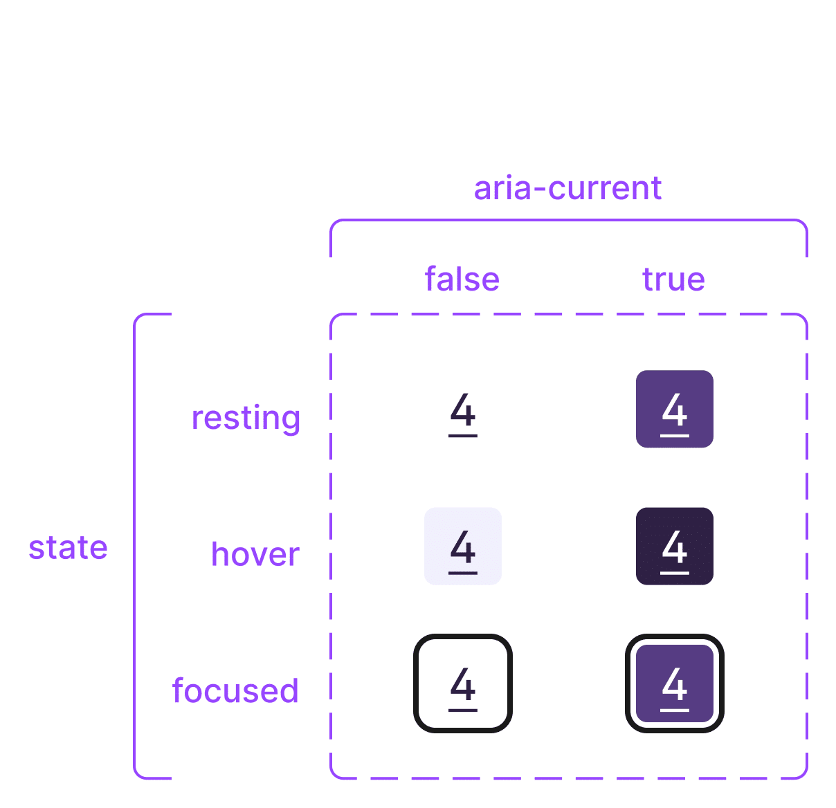
To design pagination links in Figma, I use 2 variant properties:
- state: resting; hover; focused; visited; active
- aria-current: false; true

Current link styles in a breadcrumb trail
A breadcrumb trail is a list of links to enable the user to trace their steps.
Some websites use common breadcrumbs, showing “the user where they are in the site hierarchy”. Others employ path-based breadcrumbs2 showing recent steps the user took. In either case, differentiating the current breadcrumb from others is paramount for the user’s sense of where they are.

Similar to pagination, some breadcrumb components do not link to the current page. Proponents argue, “The user doesn’t have to navigate to the page they already are at.”4 Regardless of whether they are used for navigating, linking the current breadcrumb gives it keyboard ‘tabbing’ access. This means screen reader users gain the additional context:
When a screen reader encounters the link identified with
Using the aria-current attribute – Tink – Léonie Watsonaria-current, it will announce something like “Home, current page link”.

Summing up
A distinct style for current page links5 in pagination and breadcrumb trails provides clear “you are here” cues in common navigation bars.6 Both pagination and breadcrumbs have simple user interfaces. Distinct styling for current links significantly boosts usability. So I hope this post helps you nail these navigation patterns.
Further reading
Both Karl Groves7 and Martin Underhill8 recommend that pagination uses links (not buttons). Additionally, Underhill infers 2 success criterion to complete accessible pagination patterns:
Also, while the ARIA Authoring Practices Guide (APG) lacks a pagination pattern, they demonstrate a Breadcrumb Example.
Footnotes
- The Skinny on CSS Attribute Selectors | CSS-Tricks ↩︎
- Breadcrumbs UX Navigation – The Ultimate Design Guide – Pencil & Paper ↩︎
- Breadcrumbs | eBay MIND Patterns ↩︎
- Breadcrumbs · Elisa Design System ↩︎
- Current in All the user-facing states – Eric Bailey ↩︎
- G128: Indicating current location within navigation bars | WAI | W3C ↩︎
- A Quick Primer on Accessible Pagination – AFixt ↩︎
- Should pagination take you to a new page? – tempertemper ↩︎

