Remediation of issues in a member registration process removes barriers to access. During manual accessibility testing, I discovered 7 issues with our form wizard. At the A11y Bytes event in Melbourne on Global Accessibility Awareness Day, 16 May 2019, I gave a lightning talk on remediating 5 of the identified issues. This is a written version of my talk demonstrating how our Digital Experience team remediated both technical and non-technical issues to make the registration process more inclusive.
Initial test session
In September 2018, manual accessibility testing revealed significant barriers to completing a multi-step registration form. I thank Jamie Kelly, who first tested our registration form wizard in September last year. Jamie is blind, has a great sense of humour, and amazing think-out-loud skills. These make him an excellent tester.
I also thank Troy Rasiah, our brilliant developer and database guru. Troy collaborated with me throughout this project. In the months following our initial test session, we made several iterations, and remediated 5 of the 7 issues identified in Jamie’s initial test session.
Lightning talk outline
- Form wizard designs
- Manual accessibility testing scenarios
- Issues identified
- How we remediated (some) issues
- Next steps
Form wizard designs
We actually have two form wizard designs:
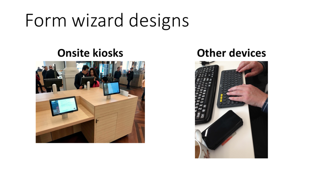
- One design for the new onsite kiosks attached to cabinetry. These onsite kiosks are touchscreens with custom onscreen keyboards. They are not intended for screen reader use.
- Branching from that is the design for all other devices. It’s this design for other devices that we tested and iterated.
Manual accessibility testing scenarios
Our testing consisted of one task, to become a member, in two scenarios:
- Using a laptop, Firefox, JAWS, and email to receive membership.
- Using an iPhone, Safari, VoiceOver, and SMS to receive membership.
7 issues identified
From our test, we identified seven issues. I classified the severity of each issue the same way I prioritise usability problems. In order of severity:
- Imperceptible validation errors;
- A mismatch from our conceptual model to the user’s mental model;
- Spinners on postcode input;
- An
<article>tag announced on every step of the<form>; - A driver’s licence was the only example document as proof of address;
- A
<label>lacks a phone format example; - A link to a modal.
Remediation of 5 issues
Read on for how we approached and resolved five of the identified issues.
Imperceptible validation
Step 1 of the form wizards asks for contact details. Jamie entered his personal details including a mobile number and email address. After pressing the Next button, validation errors displayed in red text on the screen. However, the screen reader was silent. There were no errors announced.
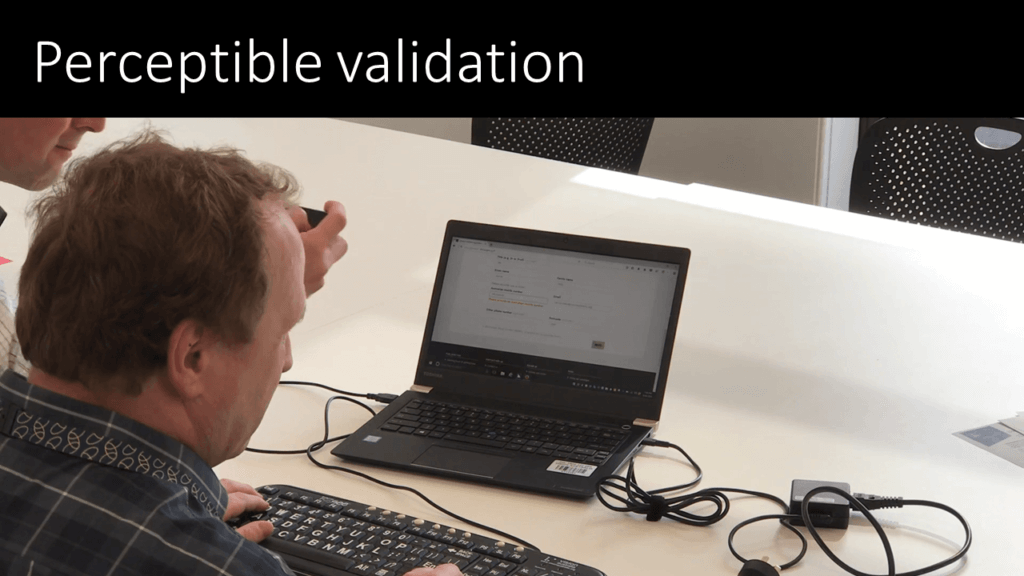
To remediate this, the screen reader needs to announce each error message. So we:
- Inserted the error text within the
<label>; - Set the focus to the first input with an error.
Our jQuery framework that handles validation had to be updated to enable this.
<button>s weren’t matching
A pattern in our old form wizard used 2 or 3 <button> elements for users to indicate their choice and take them to the next step in the flow.
- It appears neat & efficient – it works on our kiosks.
- It has perfectly valid mark-up.
For example, step 2 asks users to choose their preferred contact for membership delivery. A screen reader announces: “We’ll send your library membership details to your preferred contact”, followed by two <button> elements.
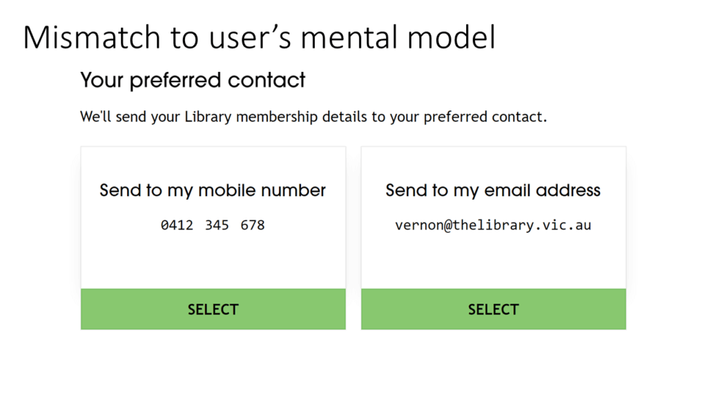
The last thing Jamie commented was, “I would have thought neither would be selected and you’d have to select one.” The <button> elements make (some) sense in the context of touchscreen kiosk devices. However, from a screen reader, the final words “…select button” exacerbate the confusion. Even if we accessibly hid the word SELECT, we still had the conceptual model of <button> elements: a mismatch to our user’s mental model. To address this, we had to replace the buttons.
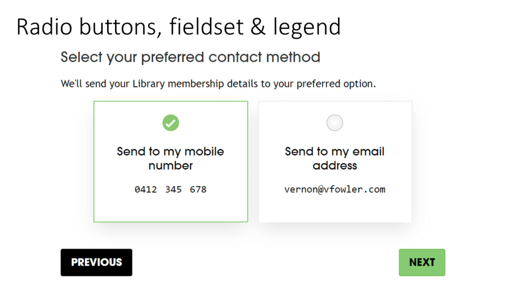
Switching to radio inputs, and adding an explicit Next button was the easy bit. The hard bit was making the choice of options mandatory in an accessible way. Thanks Russ Weakley and Allison Ravenhall who contributed to our solution: using aria-describedby to have both a hint and validation message associated with the <fieldset>. When Jamie tested this in February, it perfectly matched his mental model.
Spinners on postcode input
Our old form design used input type=“number” for entering an Australian postcode. This makes it easy for Android and iOS but on desktop devices, it presents spinbox controls.
We could turn off number input spinners for sighted users. However, screen readers still announce them. The spinbox announcement confused our blind participant and exploded the time taken to complete this field.
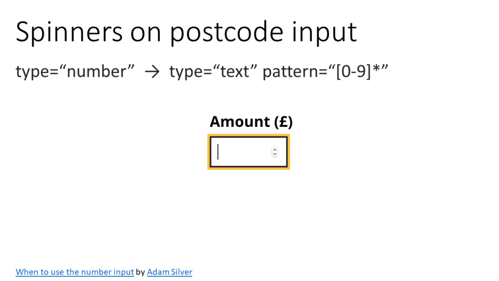
Adam Silver wrote a blog post, When to use the number input. In this post, he explains the most inclusive way to capture numeric codes. He suggests using an input type="text" with a pattern="[0-9]*" attribute. This removes the spinners both visually and to screen readers. Additionally, some smartphones will render a chunky number-pad for easy entry. Furthermore, try adding an inputmode. It should introduce a numeric keypad for Android mobiles too.
<article> on a <form>
Each form page was initially built from an old template. This template included an <article> tag. Screen readers announce “article” on each step of the form. That was just confusing! So we removed HTML5 article elements from the template. Another remediation was marked as complete.
Driver’s licence … ineligible
Victorian residents are eligible for access to e-resources from offsite. To obtain this additional privilege, members must prove they live in Victoria. A driver’s licence was the only example of proof mentioned on the form. However, blind people are ineligible for such things.
Although we added a utility bill as a second example, this does not remediate the issue for Jamie who pays his bills electronically. Also, the alternative of receiving a letter by mail would rely on a third party. So by adding a second example, we have partly resolved this issue, but not yet for everyone.
Remediation next steps
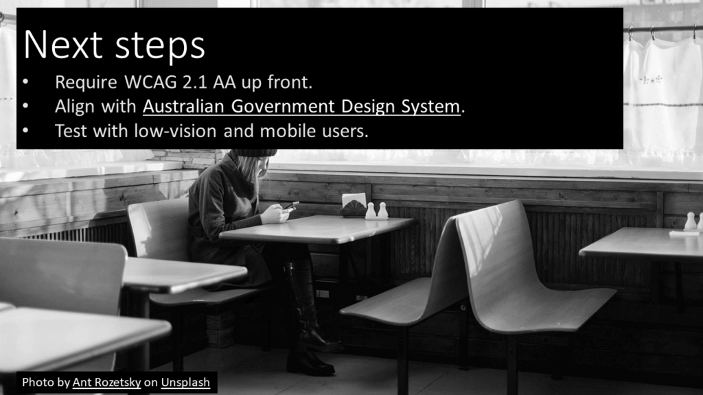
This remediation work took several iterations after the form was launched. To reduce remediation efforts in future, and have better designs out of the gate, some next steps I’m taking include:
- WCAG 2.1 AA as a requirement upfront;
- Explore how might we align form components with those in the Australian Government Design System;
- Plan to test with low-vision and mobile users.
Testing with blind people is great for uncovering issues like mismatched mental models and keyboard operation issues too. A mismatch of the conceptual model to the user’s mental models is one of many issues that cannot be picked up by automated testing techniques.
Other issues I’d like to test with sighted users are those such as low contrast, confusing visual hierarchies, spacing issues with touch targets, and text size too small. Including people with low-vision and mobile users in future testing would help us learn how to design more inclusive experiences and robust interfaces.
Sharing our remediation efforts in a lightning talk was a blast. Our iterative fixes to web forms achieve quality outcomes for people with a disability. They also bring us closer to our strategic goal of no barriers.


2 comments
Comments are closed.