Australian supermarket giant Coles is improving their web applications to avoid unlawful discrimination 1. A 2019 audit of an internal application discovered several accessibility issues. My remit was to address these issues. This case study focuses on solving problems with grid design.
Background #
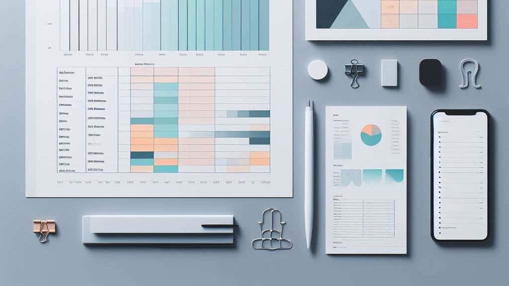
At Coles supermarkets, each week’s promotions are planned and managed behind the scenes in a spreadsheet-like desktop-designed web application, the Promotion Manager application.
Problem #
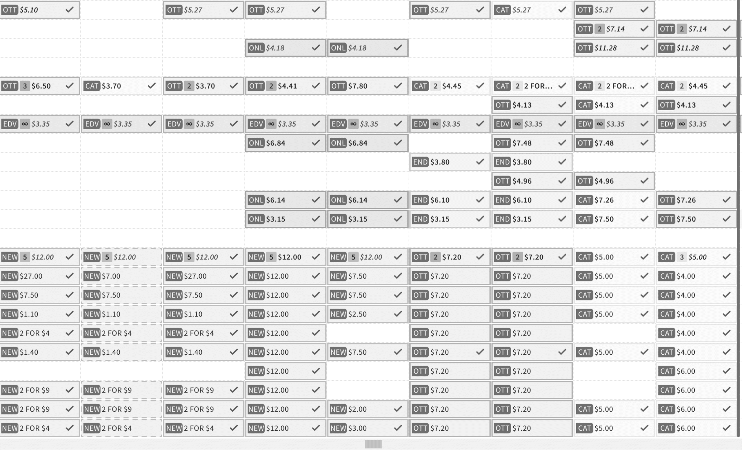
In the application interface, grid cell backgrounds use a colour selection to convey the type of promotion. For example, cells that contain Flybuys promotions have a blue background colour.
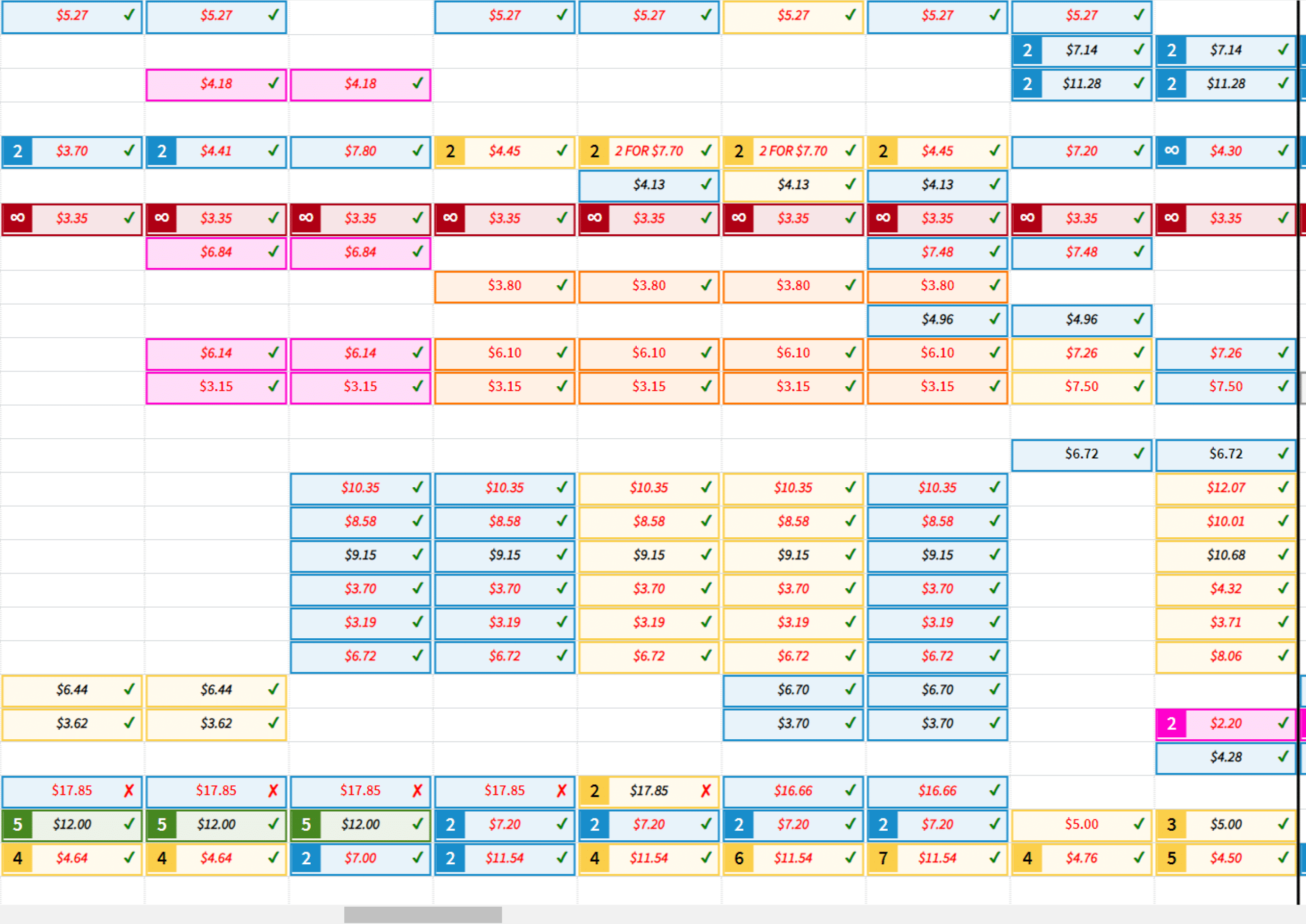
The old grid cell design fails two level A success criteria from the Web Content Accessibility Guidelines (WCAG).
Research insights #
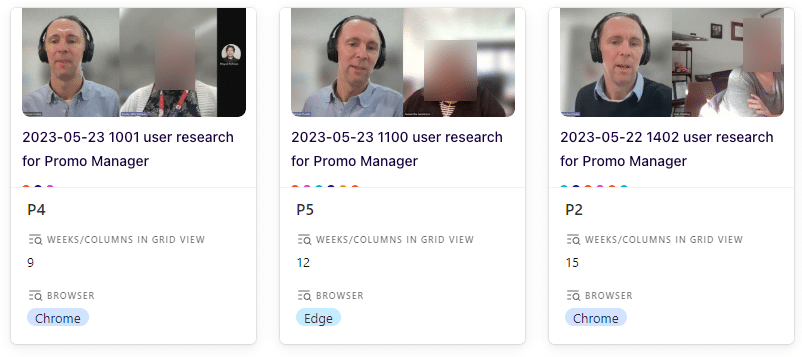
I planned and facilitated research interviews to listen to users’ language and learn insights directly. User research helped me uncover design constraints and content ideas.
In Promotion Manager, promotion grid cells were 118 pixels wide. At the default 100% browser zoom, this shows about 8-weeks of data columns. A common user task is to copy a promotion from one column to another 10 or 12 weeks later. Rather than scrolling horizontally, interviews revealed that participants decreased browser zoom to see patterns in up to 15 columns at a glance.
Interviews also uncovered that participants were quick to recognise some cell background colours. Counter to a suggestion to discard the colours, participants valued the quick recognition of familiar background colours. Furthermore, they expressed an aversion to discarding colours.
A third insight was that participants used particular vocabulary when describing promotions. I added their terms to the custom vocabulary in Dovetail to improve transcription. Also, I documented the terms they use to describe promotion types for later use as content ideas.
Actionable takeaways to redesign grid cells #
The key takeaways from user research were:
- Avoiding a wider grid cell width is important.
- Retain the coloured backgrounds, and redesign grid cells with content that complements the colours.
- Write promotion types documentation and possible abbreviations based on discovered user vocabulary.
Solution #
To build empathy, I presented stakeholders with greyscale simulations of the old and new grid designs.
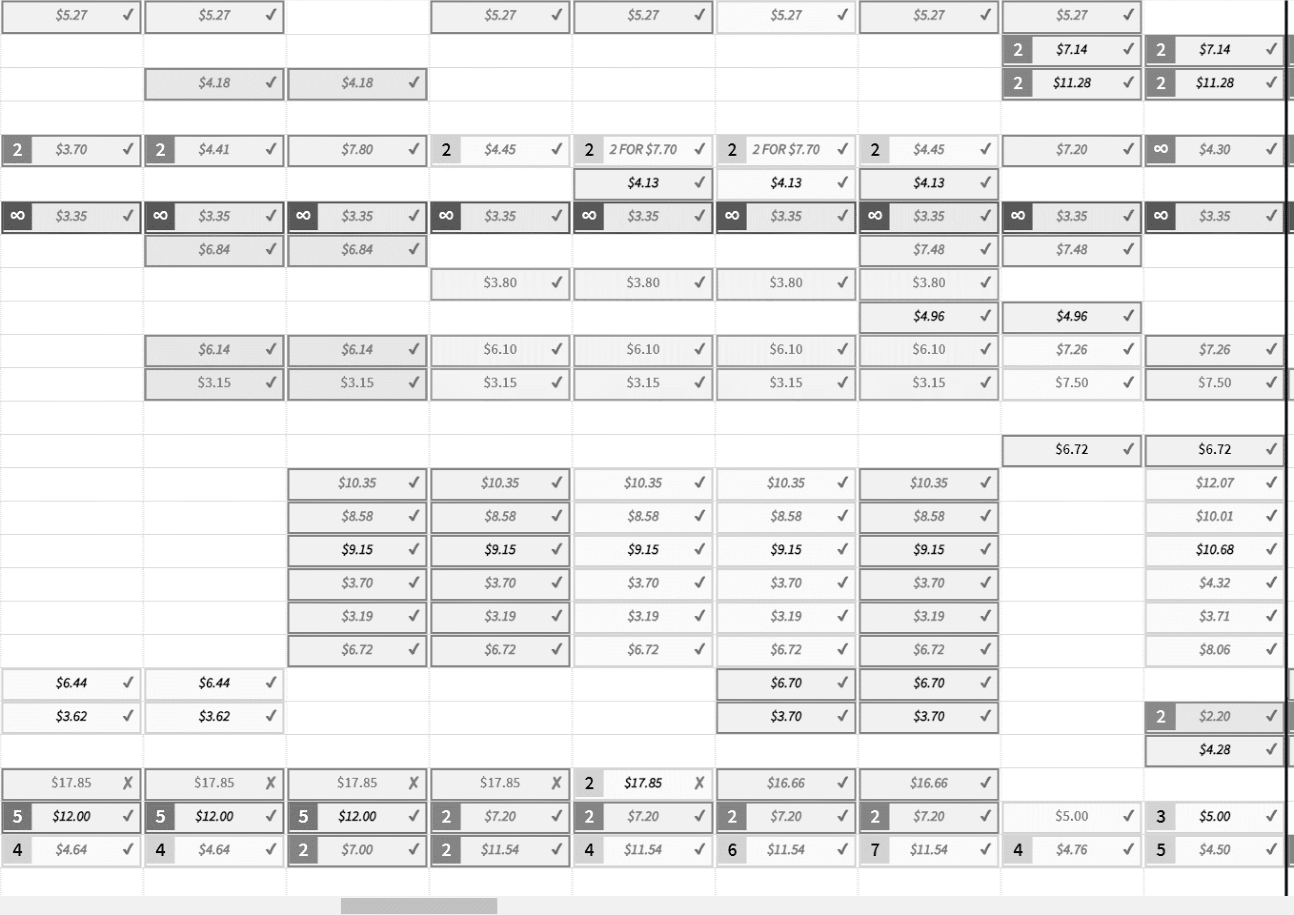
Sharing greyscale simulations helped stakeholders understand user frustrations with the old design.
A greyscale simulation also validated the redesigned grid cells.
I inspected the existing grid cell and analysed its anatomy.

Then I designed grid cells as a bespoke modular component informed by research insights, with a variant for each promotion type and corresponding background colour.
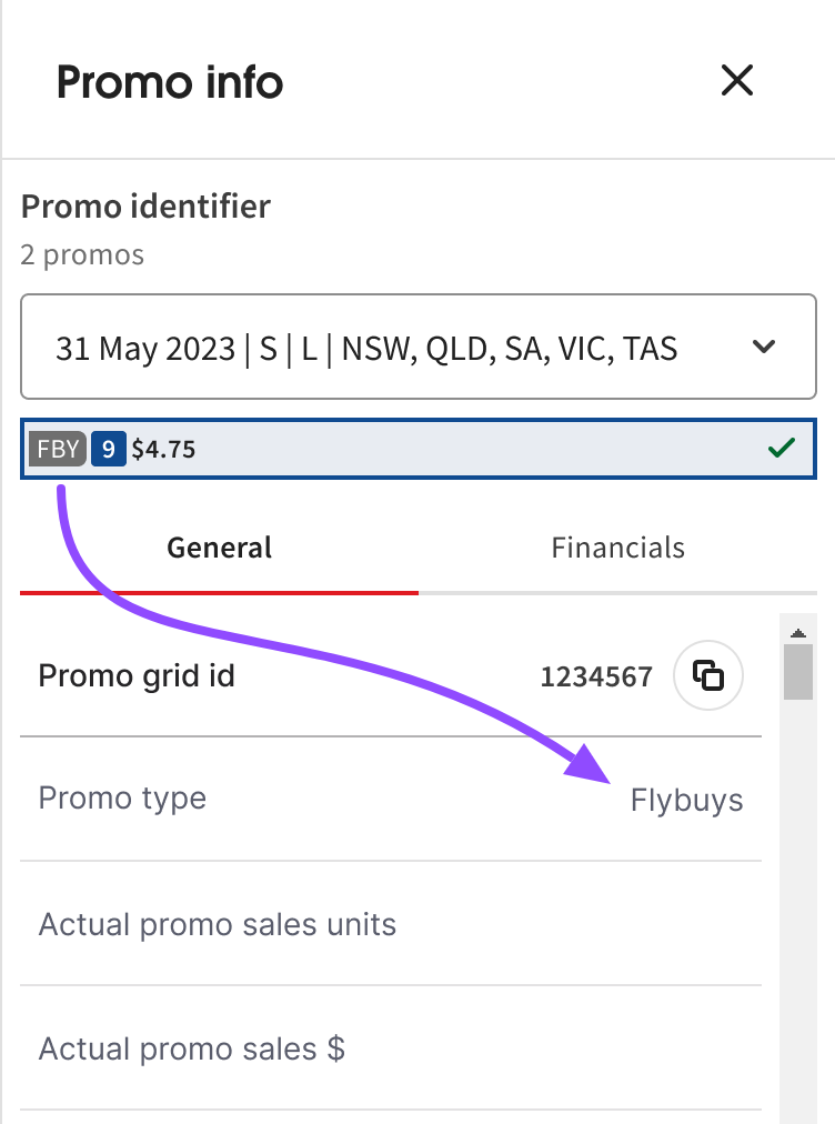
I added a pill with a 2- or 3-letter abbreviation of the promotion type. This technique is similar to a colour-coded schedule with icons. 4
The abbreviations and their corresponding expanded terms employ documented vocabulary discovered during user research.

My grid design adds visually hidden text that expands the abbreviation for assistive technology users. Upon interacting with a cell, progressive disclosure now shows the expanded term in my sidebar redesign.
Results #
Adding text content to each coloured cell conveys the meaning in a complementary manner. Abbreviation text echoes users’ language and vocabulary. Furthermore, abbreviation content is expanded in full for screen readers, and sighted users when Promo info is opened in a sidebar drawer. These mechanisms ensure users can access the expanded form of abbreviations, and this meets Level AAA success criterion 3.1.4 Abbreviations 5.
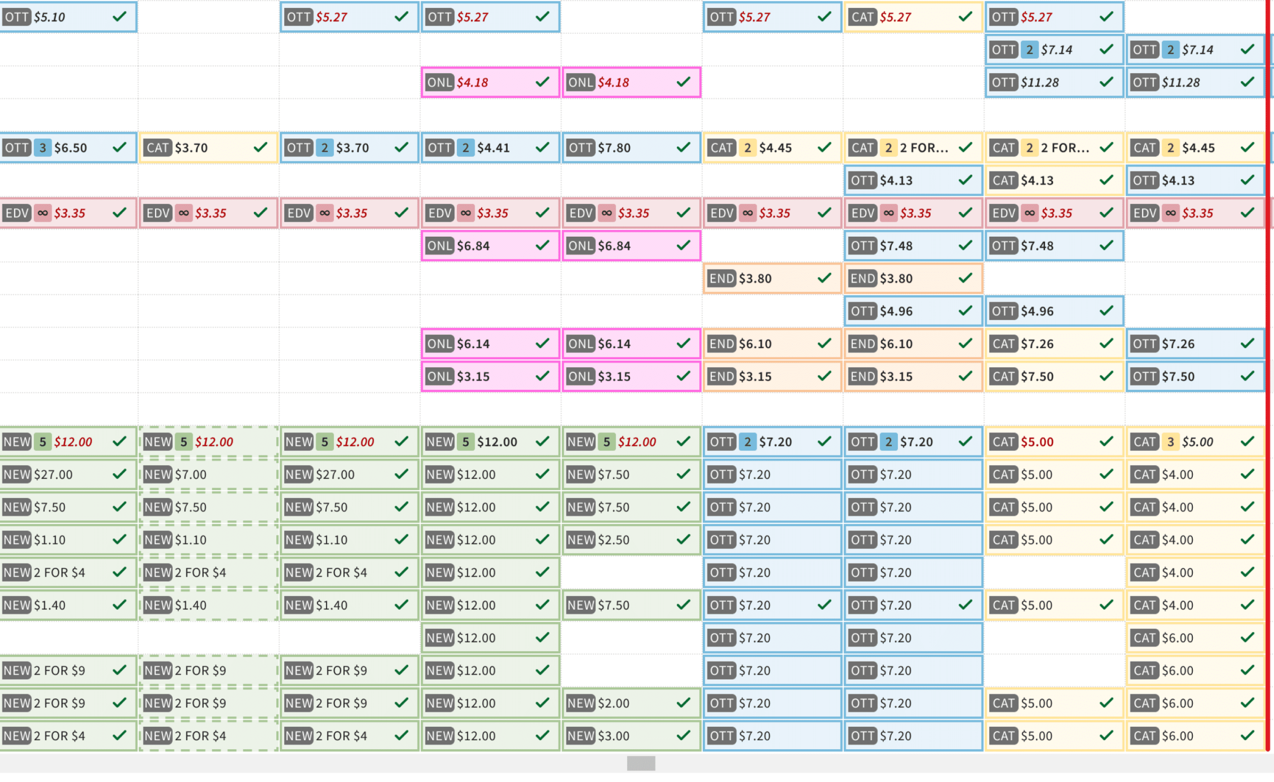
The new design of grid cells retained background colours, and increased cell width by only 6 pixels, 5%.
The left alignment of the abbreviation and other content further improves the readability and visual scanability of cell contents.
Follow-up sessions with users validated the new grid cell design and helped further iterate on the abbreviations content.
Footnotes #
- Blind woman launches claim of unlawful discrimination against Coles over website ↩︎
- Understanding SC 1.4.1 Use of Color (Level A) ↩︎
- Understanding the intent of SC 1.1.1 Non-text Content (Level A) ↩︎
- A color-coded schedule with icons in Technique G14: Ensuring that information conveyed by color difference is also available in text ↩︎
- Understanding SC 3.1.4 Abbreviations ↩︎