Since September 2018 our registration form wizard used a mix of inaccessible default browser error messages and ambiguous custom validation messages in red text. They presented several issues, especially for users with visual disabilities. In this post I’ll outline 6 techniques we used to upgrade form validation messages in bespoke web forms. Through October & November 2019 we applied these techniques to further iterate our registration form wizard and to bake improved patterns into upcoming donation and subscription payment forms. These upgrades help users understand what went wrong with their input and how to fix it.
Exposing error messages
We often start with the happy path, a scenario where everything goes as expected (i.e. no errors). This is usually a good starting point, since it allows stakeholders to focus on the goal of the said feature/product. However, it is critical not to stop here. Let’s face it, errors happen all the time, whether they are caused by the user or the system.
Designing the Not-So-Happy Path by raymonst
For web forms, our happy path means wire-frames with empty input boxes and no validation errors shown. At this point in the process, our team usually has mocked-up interfaces in the ideal state and the success state. Then we translate designs into HTML form pages, and I start triggering the error state. A default browser error message appeared only momentarily after a submit while some custom error messages remained exposed until I corrected my input.
Before I could design a better experience with forms, I needed to expose errors consistently and persistently. First I had to eliminate the problems HTML5 form validation.
Switch from HTML5 form validation
HTML5 input attributes for validation such as required, type="email", and pattern are a fabulous starting point. They set rules around acceptable input that we can readily inspect in browser dev tools. However, there are accessibility issues with default browser error messages. Sighted users will face issues such as:
- an error message is shown only for the first invalid input – What about the rest of my invalid fields?
- the error message is shown temporarily and disappears on input focus from mouse, keyboard or touch interaction!
- browser default error messages are generic and fall short of being understandable let alone easy to recover from.

The challenges then are to have:
- all invalid inputs display an error message
- error messages that persist regardless of where focus is
- custom error messages crafted to help a user recover from the specific situation
HTML5 input validation attributes are helpful. However, relying on a user’s browser to display default validation errors is harmful to their experience. With bespoke forms, we can disable the default browser validation.
If you’re confident of your error messages, you can remove the browser validation by adding the
Don’t Rely on Default Browser Error Messages by Julie Grundynovalidateattribute to the wrappingformelement, like this:<form novalidate>...</form>
Now we rely on JavaScript to validate all input values, and for each invalid input inject an error message that will persist until form submit.
Contrast better than red on white
Previously our form had custom validation messages styled as 16px bold red text on a white background. CSS code for error messages looked like this:
.error {
  color: red;
  font-size: 16px;
  font-weight: bold;
}
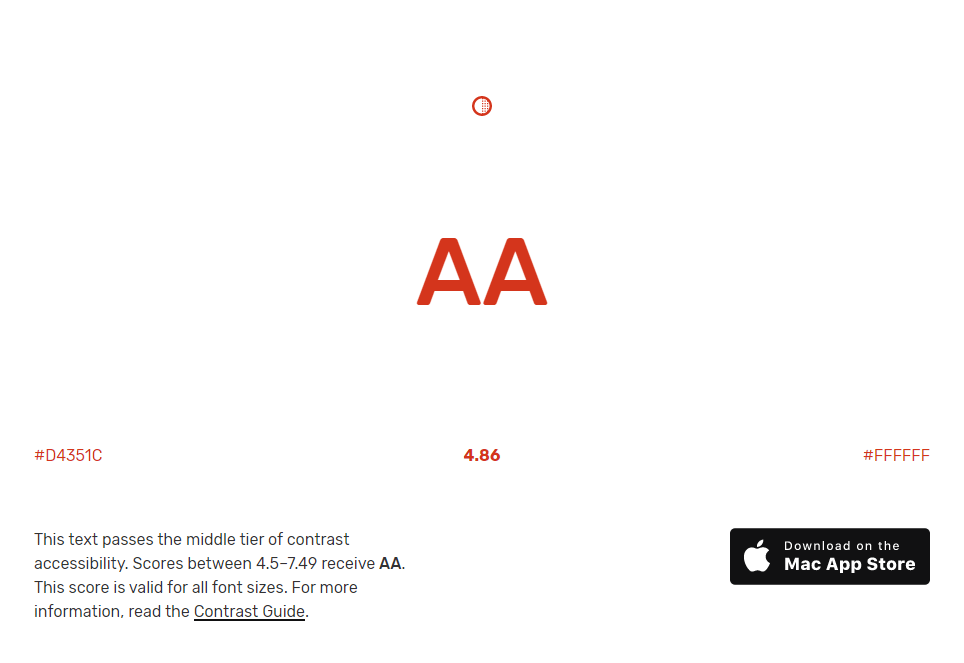
On a white background, 16px bold red (#FF0000) text only has a contrast ratio of 4:1. Our red validation messages fail the requirement of minimum contrast!

So I adopted the darker red used in GOV.UK Design system error messages. Their error messages uses color: #d4351c which, on a white background, passes the minimum contrast requirement for Level AA. At the same 16px size this colour combination can be used by most sighted users. Users with cataracts, low vision or phone screens in night shift mode will benefit from this colour combination in 19px bold or 24px.
Tools for a better red
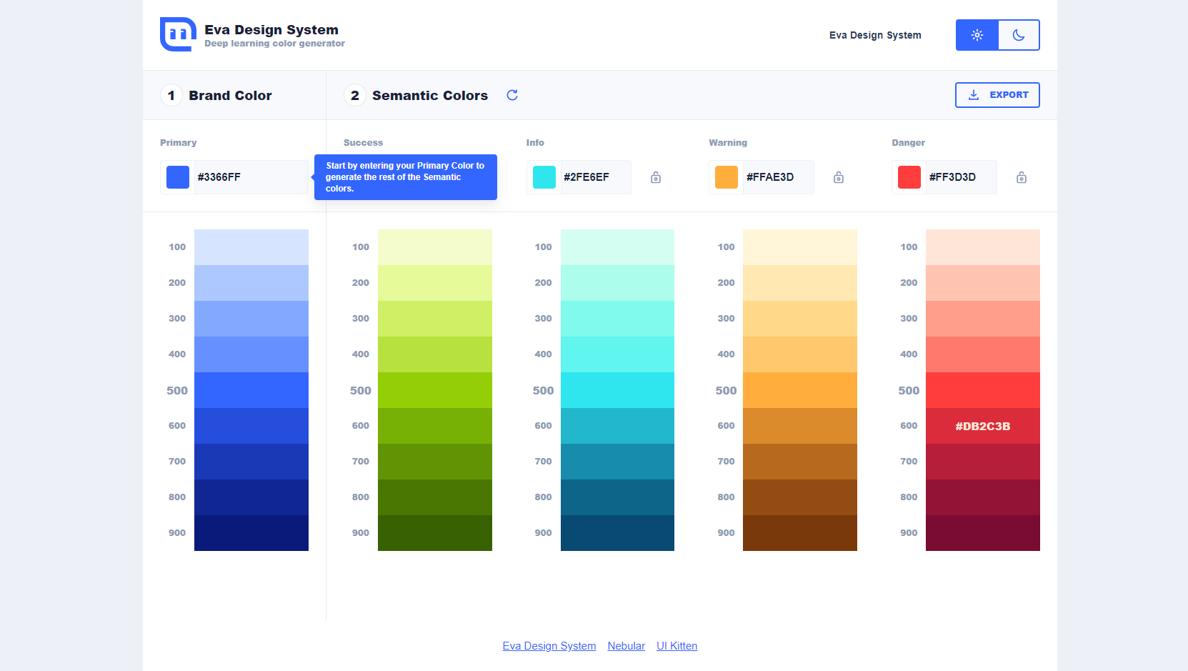
While we adopted #d4351c, you may need an error colour more inline with your brand. You might choose a shade of danger from an AI generated semantic colour palette based on your brand’s primary colour.
Test your chosen error colour with tanagaru contrast finder. Where a tested colour combination fails to have enough contrast, tanaguru displays a range of nearby alternative colours that pass.
Add an icon for sighted users
Using a higher contrast red is great. However, our injected texts still relied on colour perception to convey that they were validation messages, and to distinguish them from labels, hints and other text.
The above juxtapose demonstrates the difficulty to distinguish error messages when without perceptible colour differences. Meeting Level A Success Criterion 1.4.1: Use of Color means not relying on colour alone to convey information such as “error is shown in red”. Adding an icon beside each validation message helps all sighted users to distinguish error messages from label and hint text.
<label for="firstName">
  <span class="field-label">Given name</span>
  <span class="field-error"><img src="https://s3-us-west-2.amazonaws.com/s.cdpn.io/236520/error.svg" alt="Error: " class="icon" />Enter your given name</span>
</label>
By including an alt="Error: " text alternative for the icon image, screen reader users also benefit with a distinction from other label text. Note the space after the colon to prevent a screen reader from mashing together the following word into one gibberish word. Being an SVG image, we can size and position it with CSS like:
.icon {
  width: 1em;
  height: 1em;
  margin-right: .4ch;
  margin-bottom: .15em;
}
Sliding the above juxtapose to the left shows how an icon helps distinguish validation messages even without colour.
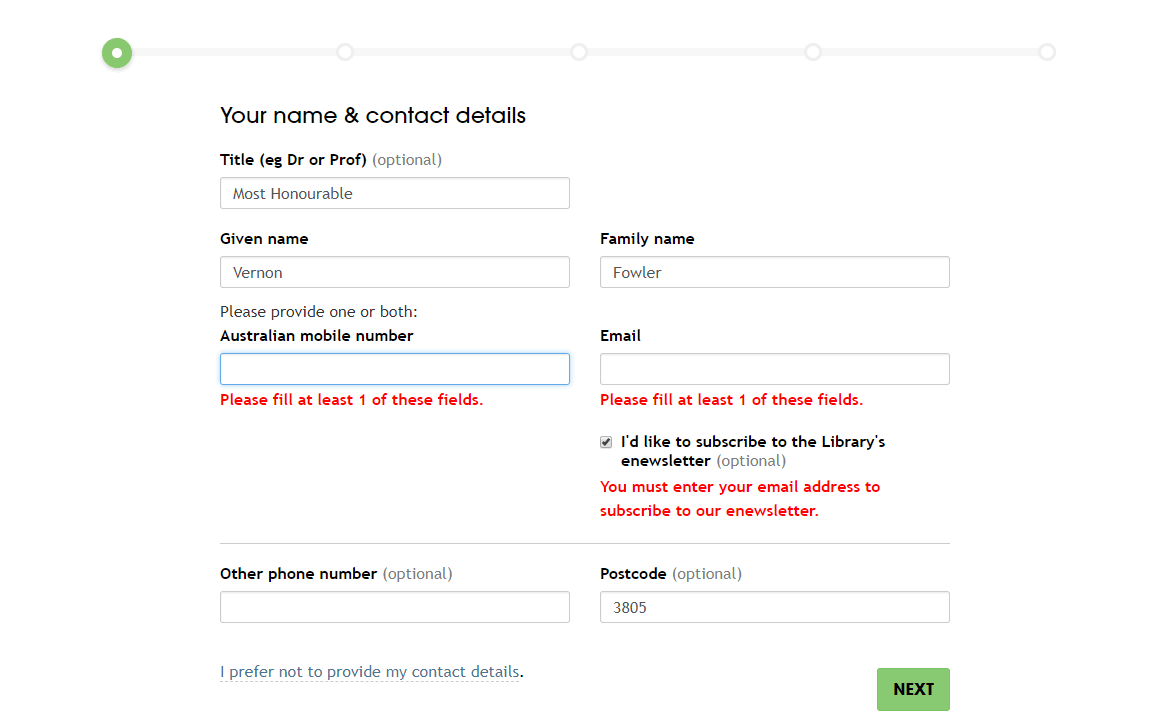
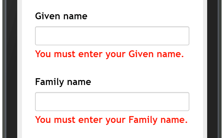
Position error messages above their input
When a validation message is injected, all content after it shifts downward. When a validation message appears below the invalid input, your gaze naturally tracks downward, away from the problem!
Also, forms asking for personal or payment information may use autocomplete options to identify input purpose. When these inputs have focus, the autocomplete interface overlays content immediately below the input, covering any error messages positioned there.
Furthermore, mobile and other on-screen keyboards can obstruct important text placed below an input. Adrian Roselli recommends to avoid messages under fields as “it may be an anti-pattern to announce afterward in screen readers”.
Rather than have error messages covered by an autocomplete overlay or an on-screen keyboard, I resolved to position them immediately above the input.
The 3 pieces above the input are in reverse alphabetical order:
- label
- hint (if any)
- error
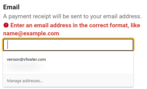
<label for="email_address">
  <span class="field-label">Email</span>
  <span class="field-hint">A payment receipt will be sent to your email address.</span>
  <span class="field-error"><img src="https://s3-us-west-2.amazonaws.com/s.cdpn.io/236520/error.svg" alt="Error: " class="icon" />Enter an email address in the correct format, like name@example.com</span>
</label>
<input name="email_address" id="email_address" autocomplete="email" type="email" required>
Show a validation message in a fieldset before required radios
Our registration form asks users their preferred method of delivery, SMS or email. A choice is required. When no option is selected, this set of radio inputs becomes invalid upon submit. Adam Silver points out in A Flight Booking Form, “it’s not the individual input that’s invalid — it’s the group.” So show one validation message before the first radio, indicating an error for the group.
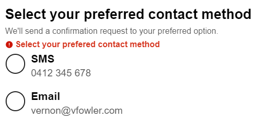
Techniques for associating the validation message with fieldset and radio buttons include:
- a
<span>inside the<legend> aria-describedby="id-of-error-message"applied to the<fieldset>aria-describedby="id-of-error-message"applied to each<input type="radio">
Also setting aria-invalid="true" on the <fieldset> advises screen readers of the error state for the group, and provides a hook for visual styling with CSS.
Custom error messages
There are multiple ways a single input may be invalid. For example, a Victorian postcode input may be required, have a minlength (and maxlength) of 4, and a pattern attribute to only accept certain digit ranges. A custom error message corresponding to each specific violation helps a user understand what went wrong, and how to fix it.
| input id/name | attribute | guidance | custom message |
|---|---|---|---|
| id=”postcode” | required | instructive | Enter your postcode |
| id=”postcode” | minlength | descriptive | Postcode must be 4 characters |
| id=”postcode” | pattern | descriptive | Postcode must be Victorian, like 3104 or 8396 |
Because our registration form wizard has 6 validations for address fields, 2 for given and family name, 2 for email address, 1 for an Australian mobile and 2 more for user preferences, I find it helpful to catalogue custom messages in a tool like Airtable. For consistency, I use error message templates in the GOV.UK Design System to craft instructive and descriptive messaging.
To review custom messages, I trigger each specific violation. I added a trigger column to my catalogue, detailing what input would expose the custom message. For example, youatme would trigger the email type attribute validation.
| input id/name | attribute | trigger | custom message |
|---|---|---|---|
| id=”email_address” | type | youatme | Enter an email address in the correct format, like name@example.com |
| id=”email_address” | required | blank / no selection | Enter your email address |
| id=”primary_phone” | pattern | 03 8765 4321 | Enter a telephone number, like 0412 345 678 or +61 400 876 543 |
| id=”postcode” | minlength | 12 | Postcode must be between 3 and 4 characters |
| id=”donation_other_amount” | min=”1″ | .89 | Donation amount must be 1 or more |
Complex violations can involve logic around more than one input. For instance, validating that card expiry is in the future requires comparing the input month and year values against the current month and year.

Consider a form validation messages summary
Having done the hard work of custom error messages, I next want to consider an error summary. Again the GOV.UK Design System provides excellent guidance on why and when to use an error summary, as well as how it works. Creating a mechanism that allows users to jump to errors is an advisory technique. It looks particularly relevant to forms containing multiple fields in a single page.
TJ VanToll wrote a codepen and a blog post on how to show all error messages based on HTML5 default browser error messages. How might we create an error summary with custom error messages? Share your thoughts in a comment.
Conclusion
Upgrading our inline form validation messages involved several steps. Switched the text colour from red #FF0000 to a darker shade meets the minimum contrast ratio required for AA Level compliance. Adding an icon helps distinguish error messages from label and hint text for all sighted users. Moving validation messages to above their input boxes means they will not be covered by autocomplete overlays or on-screen keyboards. Writing custom error messages aids understanding what went wrong, and how to fix it. Implementing these techniques ought to reduce the time to recover from errors and might lower form drop out rates. As a result, upgrading validation messages improves the user experience by removing frustrations while filling out web forms.
1 comment
Comments are closed.