I used wireframes and flows to start coding a prototype form wizard. My artifacts aided our handover process. I levelled up my skills and mastery of tools.
Tag: accessibility
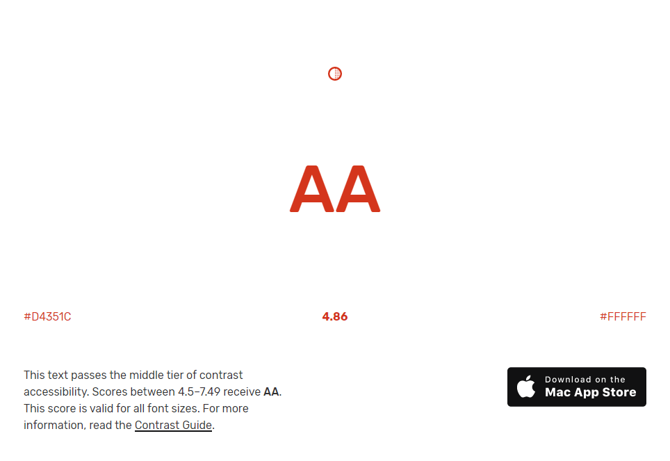
My accessibility posts include tips on increasing colour contrast beyond compliance, improving the experience for motor-impaired users, and using ARIA.
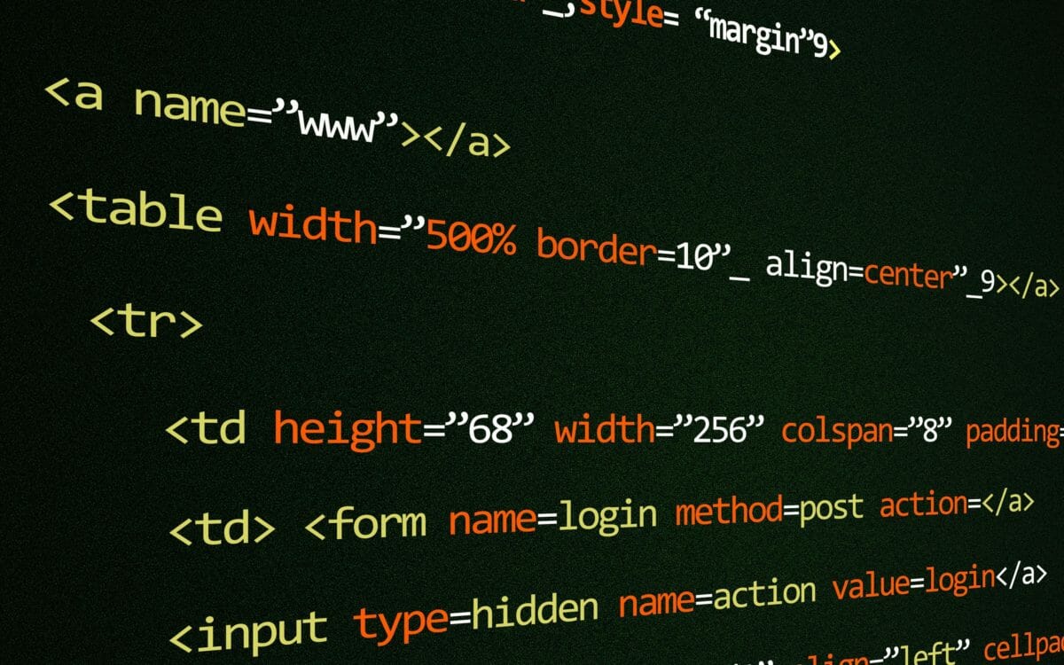
Web accessibility is the inclusive practice of ensuring there are no barriers that prevent interaction with, or access to, websites and web applications by people with physical disabilities, situational disabilities, and socio-economic restrictions on bandwidth and speed.
For example, when a site is coded with semantically meaningful HTML, with textual equivalents provided for images and with links named meaningfully, this helps blind users using text-to-speech software and/or text-to-Braille hardware. These also make websites optimised for search engines such as Google.
When text and images are large and/or enlargeable, it is easier for users with poor sight to read and understand the content. When links are underlined (or otherwise differentiated) as well as coloured, this ensures colour blind users will be able to notice them. When clickable links and areas are large, this helps users who cannot control a mouse with precision.
Wireframing a web form wizard
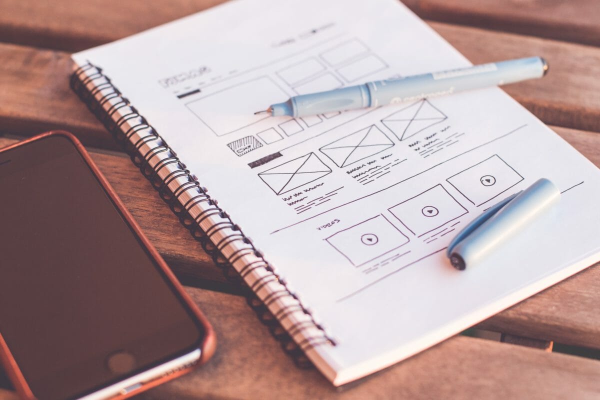
I sharpened my wireframing skills, uncovered form and flow improvements, and created thoroughly commented artifacts that aided my handover conversation.
A small win to fix your LibCal interface
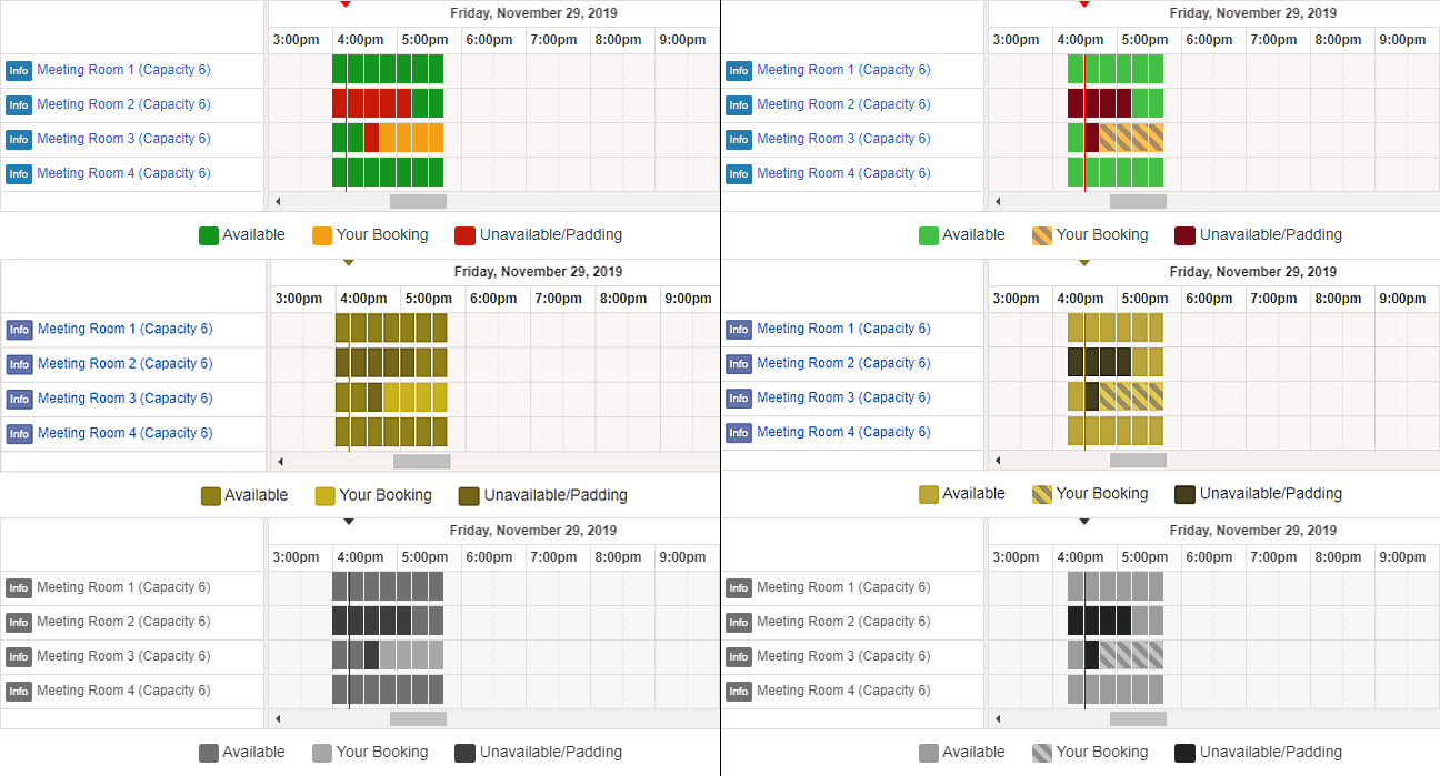
It’s a small win to fix the interface in your library room booking software. Add stripes to help sighted users distinguish their booking.
How to improve form validation messages
Our registration form wizard used a mix of inaccessible default browser error messages and ambiguous custom form validation messages in red text.