
Identify input purpose (autocomplete values) makes easier and faster form filling experiences for everyone entering personal or payment information.
Tag: mobile
Each week, new devices appear with varying screen sizes, pixel densities, input types, and more. Creating great mobile (and immobile) experiences. Constraints, challenges, and new opportunities. Mobile-first. Content-first. Responsive workflow. Responsive Design + Server Side Components (RESS). JavaScript, APIs, and progressive enhancement. Designing for hand, lap, and desk.
Digital prototyping workshop at the 2019 UXLibs conference
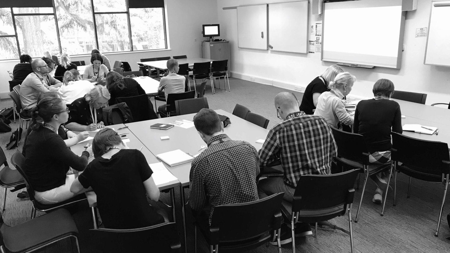
To improve the mobile experience of reserving a group study room – the case for my digital prototyping workshop at the 5th UXLibs conference.
Input width makes it easy to guide sighted users

Setting input width to guide sighted users reduces cognitive effort needed to fill out forms. I’ve created HTML and CSS code to set width of a postcode field.
4 Mobile form improvements for better UX – registration

I designed 4 mobile improvements to a registration form. These UX improvements make it faster to complete, easier to fill out, and increase data accuracy.